The "fung huang", or paired phoenixes, motif that inspired the design of the Phoenix Channel logo is often referred to in Chinese popular culture as symbolizing the unity of harmony and strength. Unlike the fierce looking Chinese dragon, the strength and power of the phoenix emanates from within. The phoenixes form a circle topped by a single crown, representing the joint venture partners’ shared goal and vision.
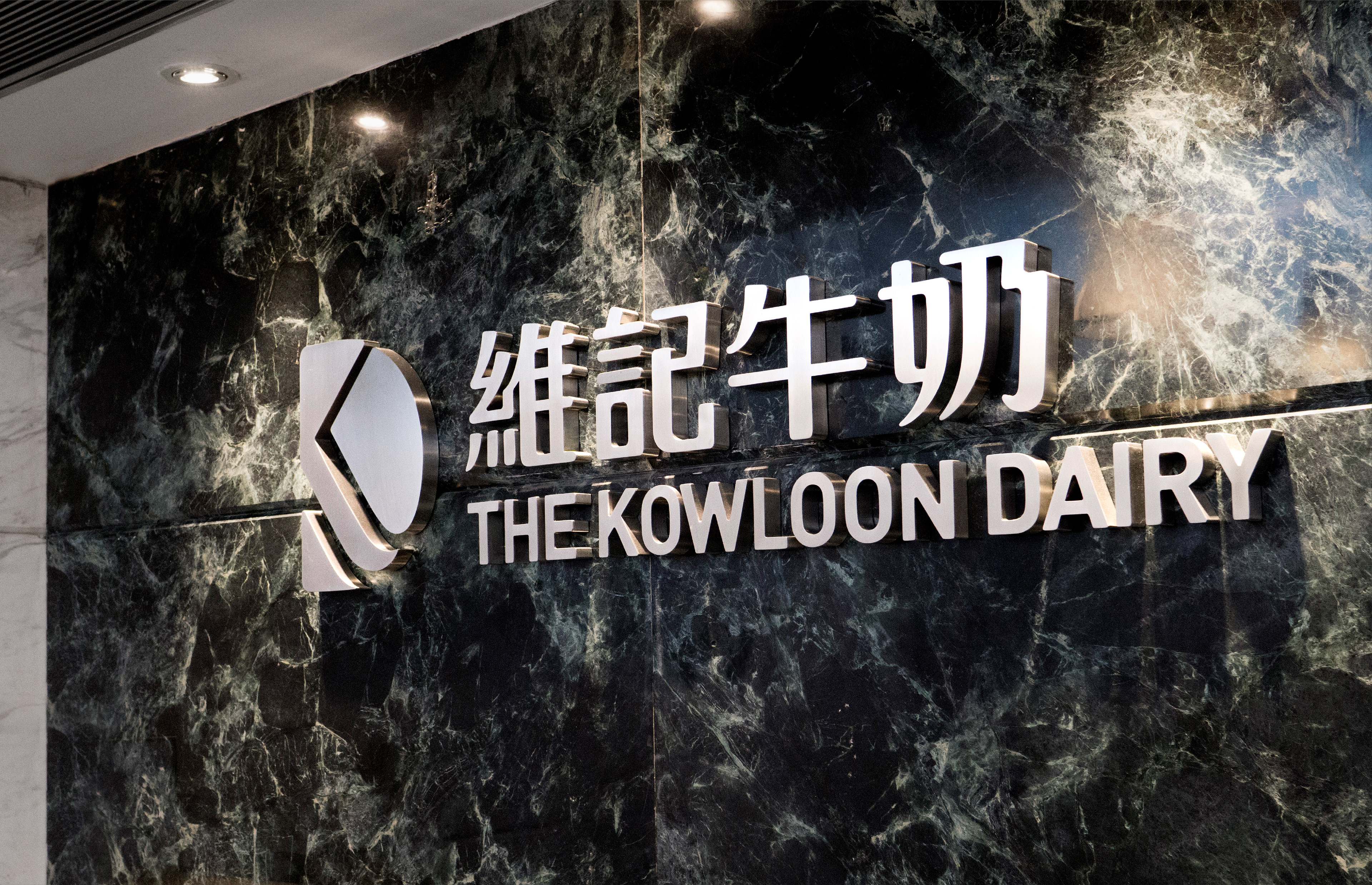
The updated Kowloon Dairy corporate signature represents the company’s long history of quality services and products. The icon encapsulates the initial K within the form of the letter D. The typeface of the name was modified to look friendlier.
Hong Kong’s oldest and one of its largest architectural firms, with over 100 years of experience, required an updated identity. The brief was to express the firm’s modern-day global practice while retaining a link to its unique heritage.
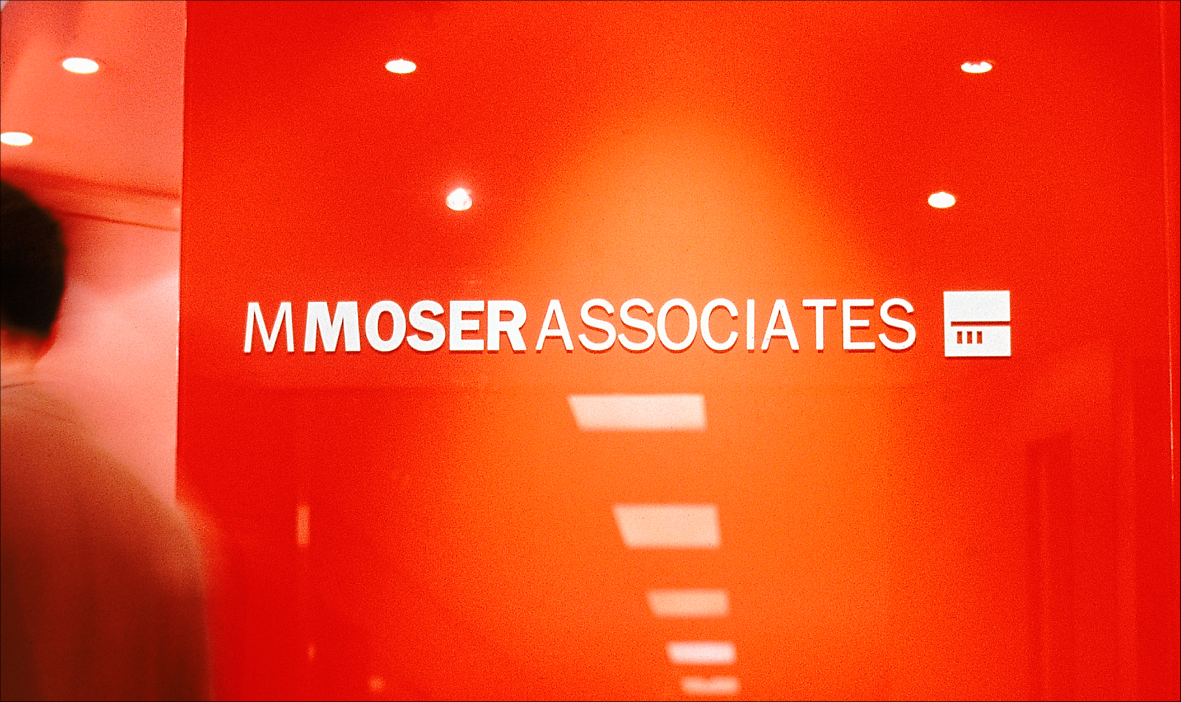
A leading Hong Kong-based global architectural firm, specializing in corporate interiors for multinational clients, needed to update its image and reposition itself in an increasingly competitive marketplace. MMA wished to be perceived as a firm with a solid corporate persona rather than as a ‘designer’ of workspaces. The solution was a new logo featuring the founder’s signature, ‘reincarnated’ in abstract form.
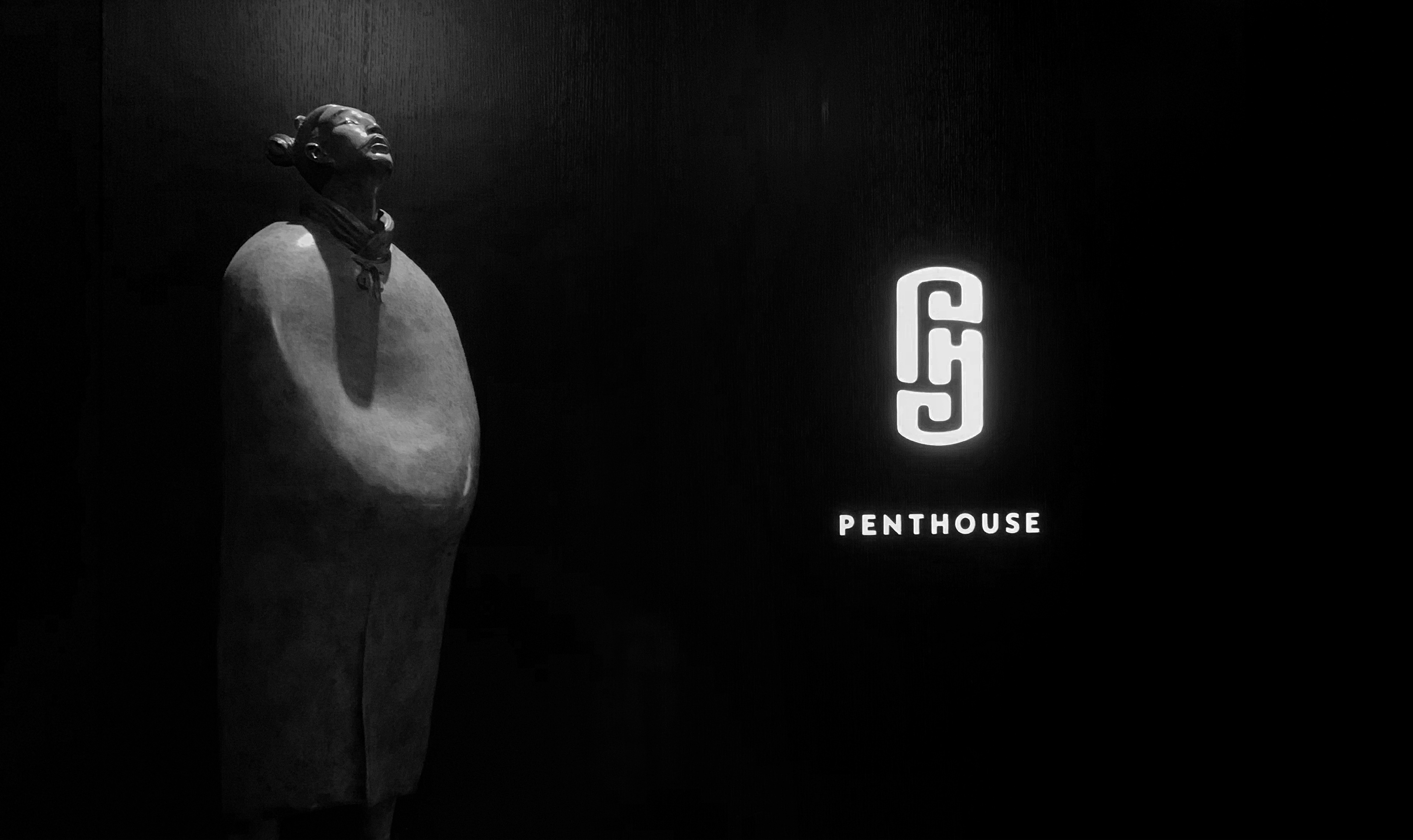
The name of the restaurant is simply PH (Penthouse 派舍), created by our long-time client Elite Concepts. The identity is designed by interpreting the theme concept - 'discovering the 'PH' balance.’
The resource-rich Chinese province of Hunan is a land of rivers and lakes. The choice of a fish, a Chinese symbol of plenitude, as the basis for Hunan TV’s identity also suggests communications and streams of information.
The school is among the most highly regarded international schools in Asia. The school needed to revitalize its image in order to retain its appeal to both local and expatriate families. A full redesign program was implemented from modification of the signature to all applications, including signage, uniforms, internal and external forms and the school’s brochure.
The school is Hong Kong’s first through-train school under the government’s ‘Private Independent Schools’ scheme. The school’s curriculum is based on three main concepts — Character Education, Knowledge Construction and Global Humanities — which foster self-reliance and creativity. The design of the icon reflects the meaning of the school’s Chinese name, 立 -- ‘standing tall’.
Brand identity for an upmarket Chinese restaurant setting in the middle of Hong Kong business district. The original Chinese character 'Fu' from the restaurant group has to be retained within the new identity.
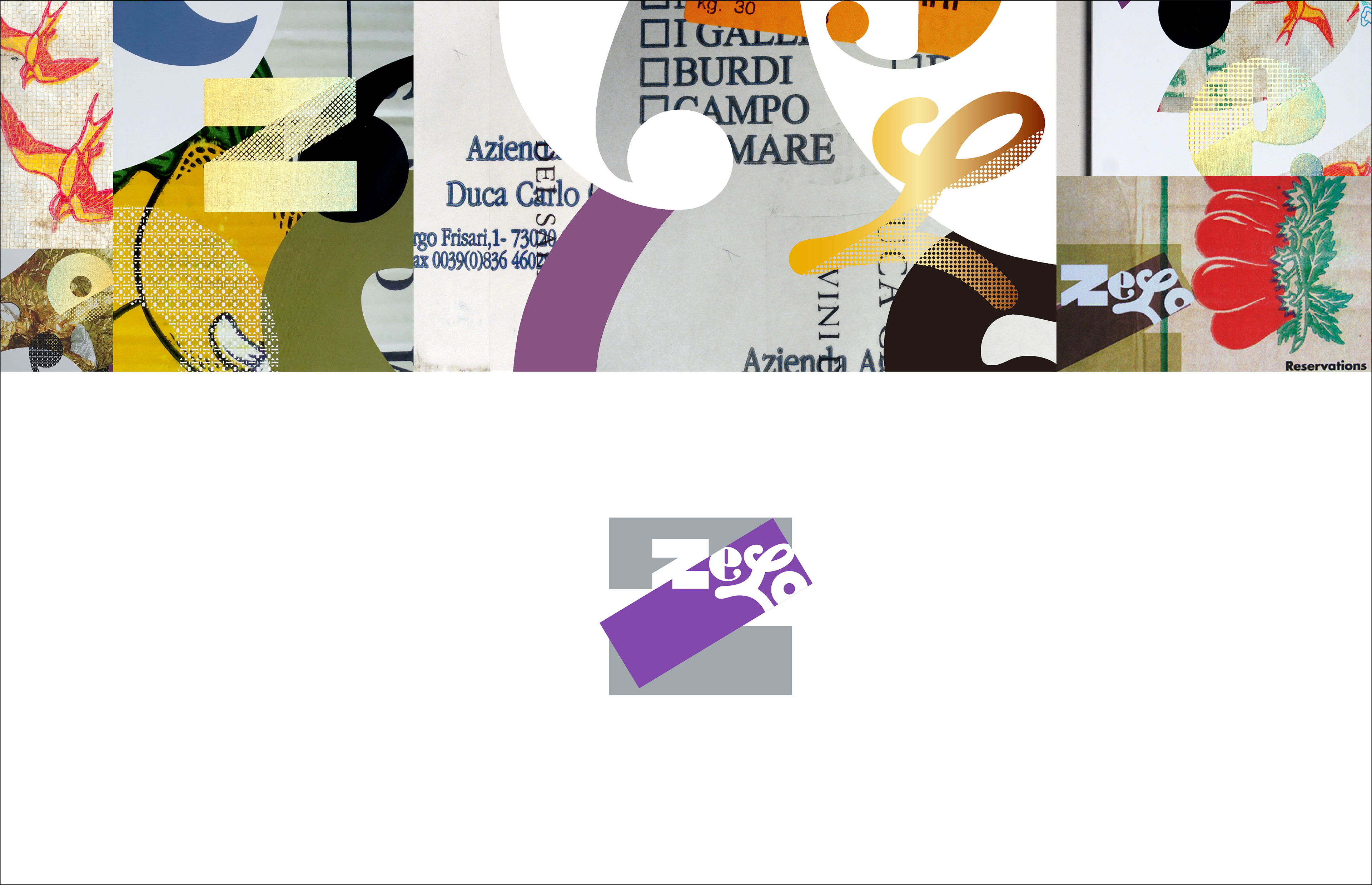
Brand identity and collaterals for Zelo, a tapas bar and restaurant in Hong Kong. The identity and applications express the architect’s theme of sustainability, using recycling typography and materials.
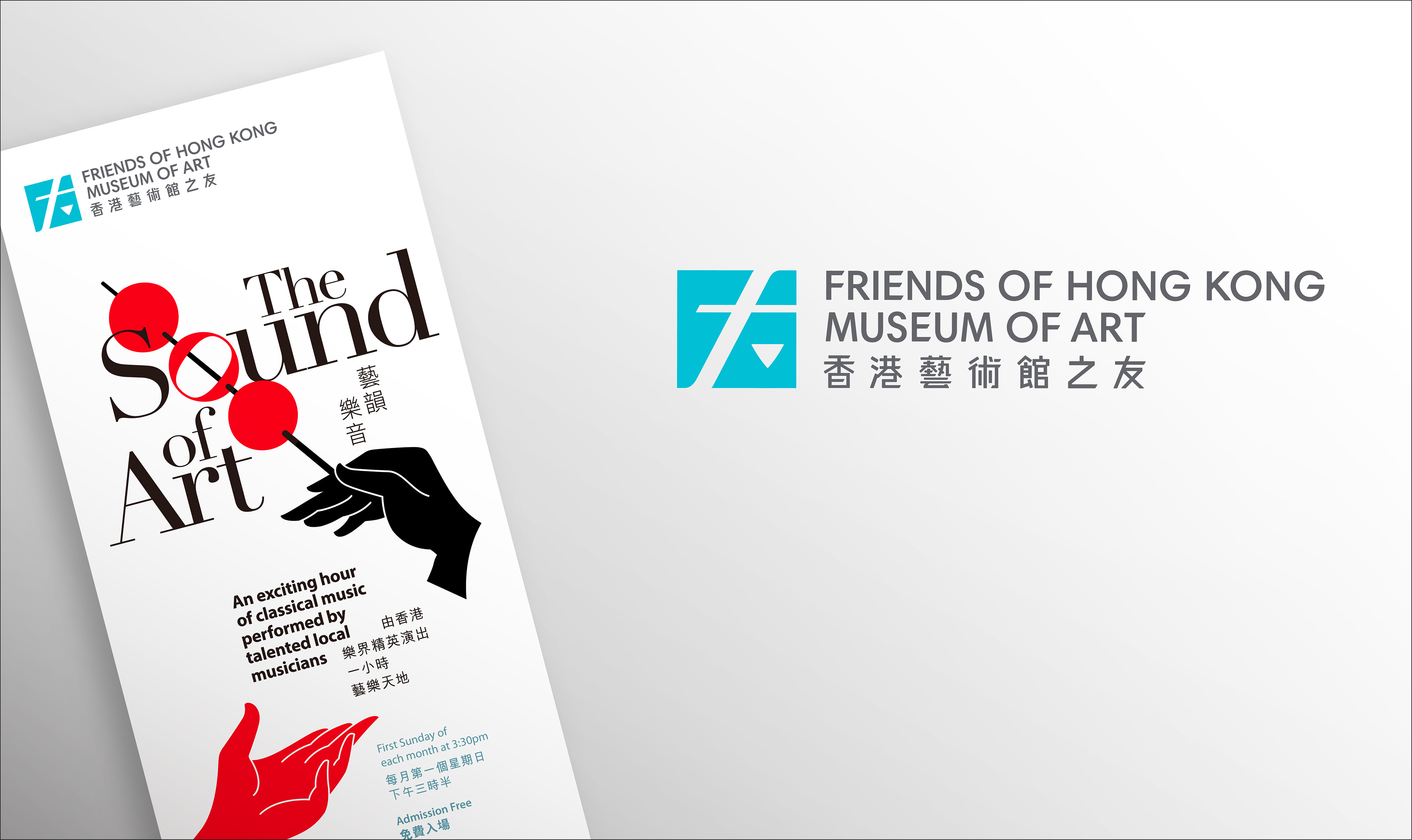
The Hong Kong Museum of Art's fund-raising committee required a new visual identity. The Chinese character ‘友’ had to be reflected in the logo, and the final design needed to have international appeal and be culturally Chinese at the same time. The design solution used elements from the italicized ‘f’ to create the perception of the Chinese character ‘友’.
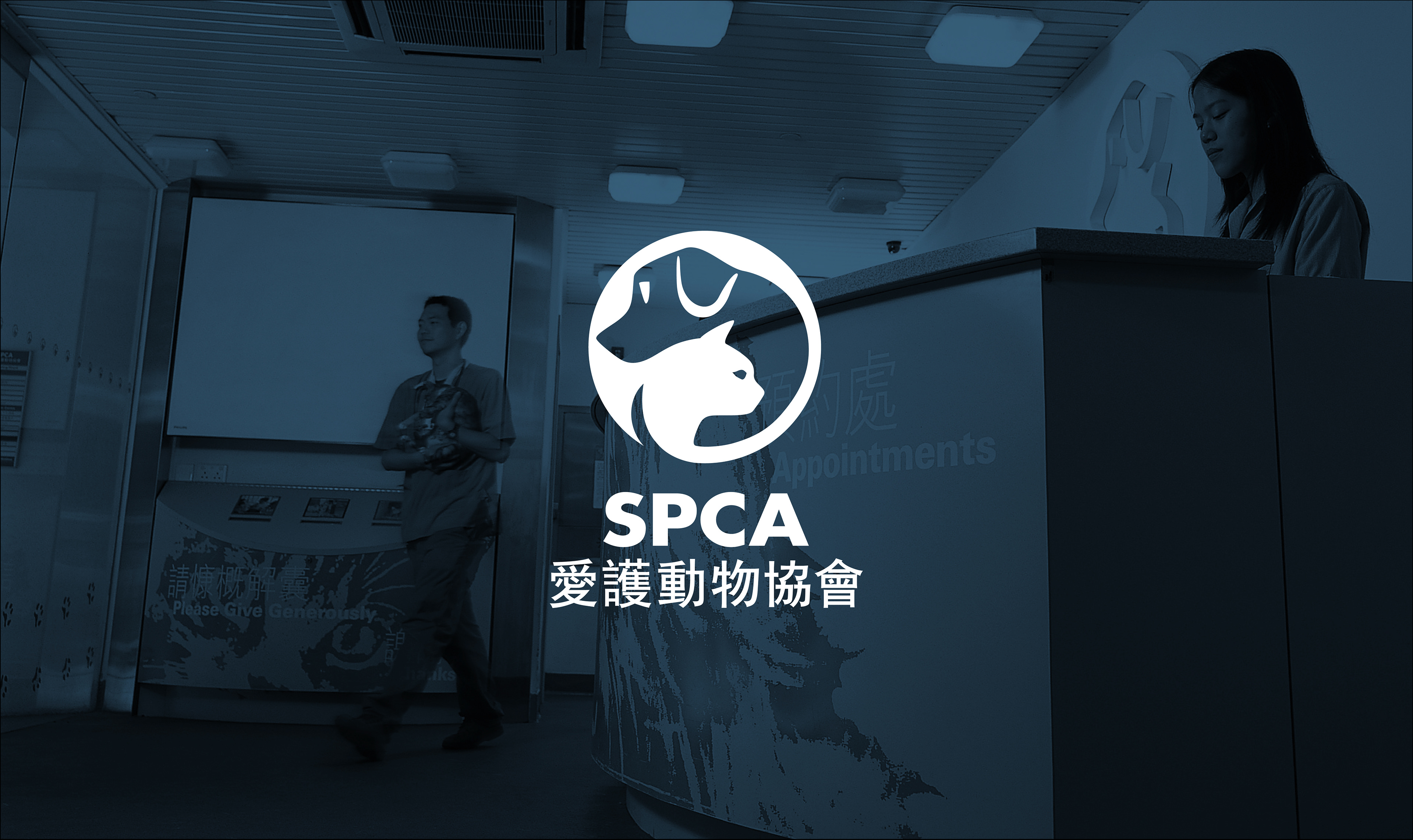
Hong Kong’s preeminent animal welfare organization was the first to provide veterinary and adoption services. The SPCA was in need of a major repositioning and new identity that would renew the public’s perception of them as a warm, caring, humane and modern institution. A core element of the SPCA’s mission is to educate the public about animal welfare and to inculcate a respect for all life.
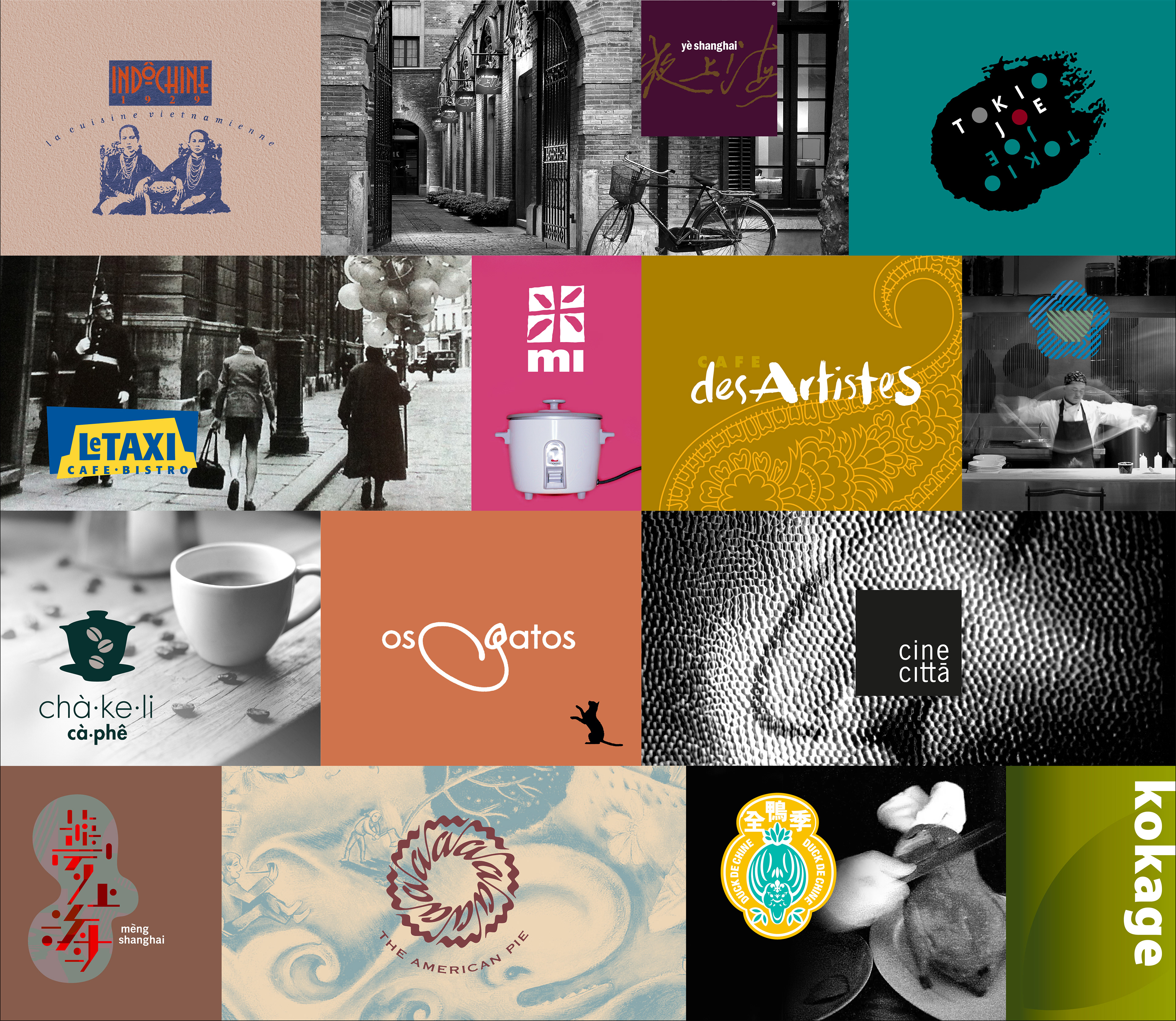
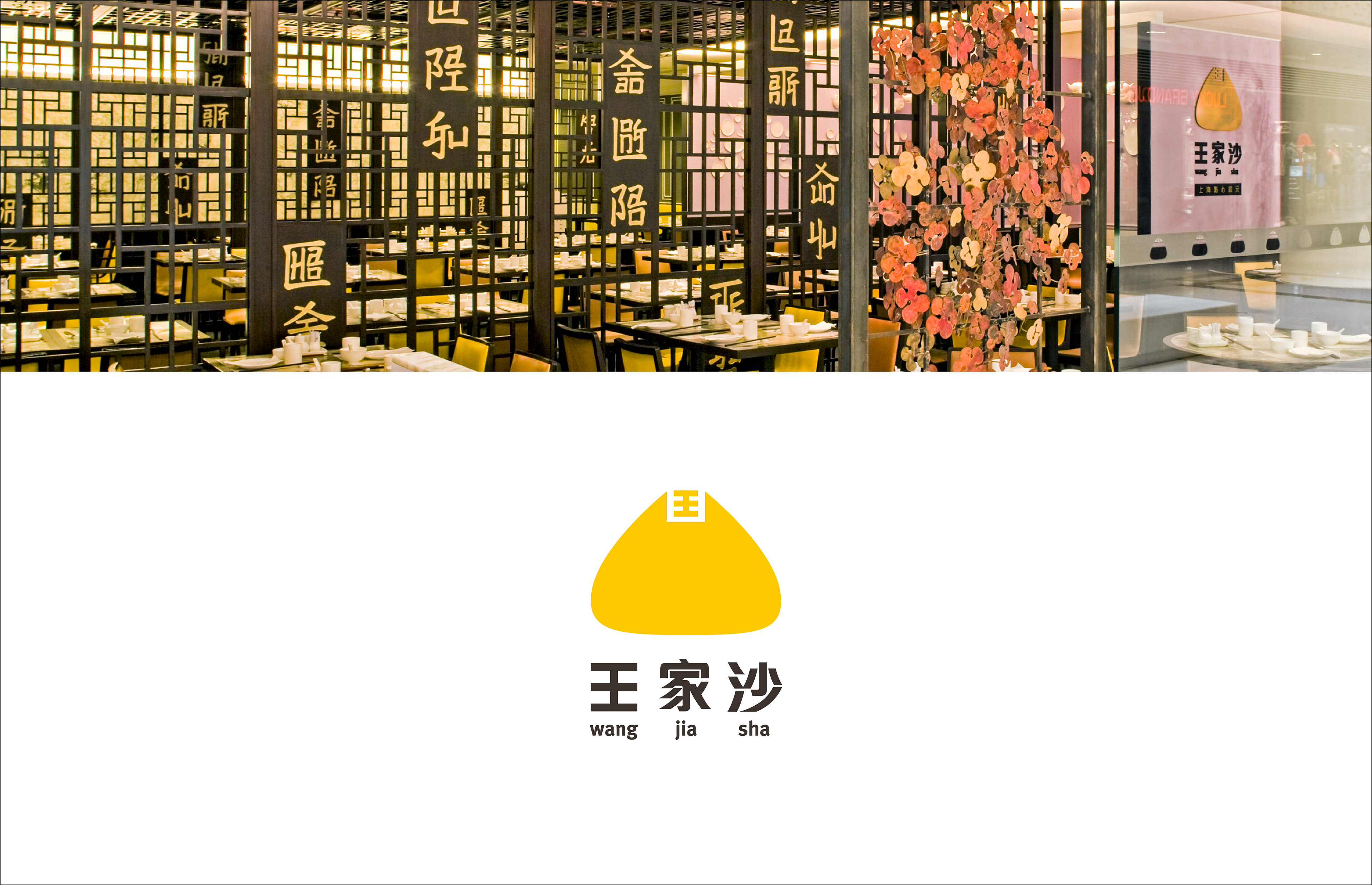
A restaurant chain originating in Shanghai and famed for its dumplings needed to redesign its brand to suit a younger local market while retaining its essential Chinese-ness.
Brand identity, environmental graphics and collaterals for a noodle eatery in Beijing.
A corporate identity for a diversified privately-held company focused on Hong Kong and China. The design of the icon refers to the founder's family name (Yung) and its Wuxi origins. It is an auspicious expression of the confluence of three waterways, representing the continuity of family heritage, diversity and unity.
This privately-held Hong Kong company offers a complete range of print sourcing, production and export logistics for leading publishers around the world. LTD undertook a complete redesign of the identity including development of a ‘constructed’ corporate brochure and promotional items for use at trade fairs.

Identity for a property developer with a flagship luxury development planned for a unique location in Hong Kong. The icon is graphically composed of a star of five “homes” formed around the Chinese character “dai 大”, which is the main character in the company’s Chinese name.

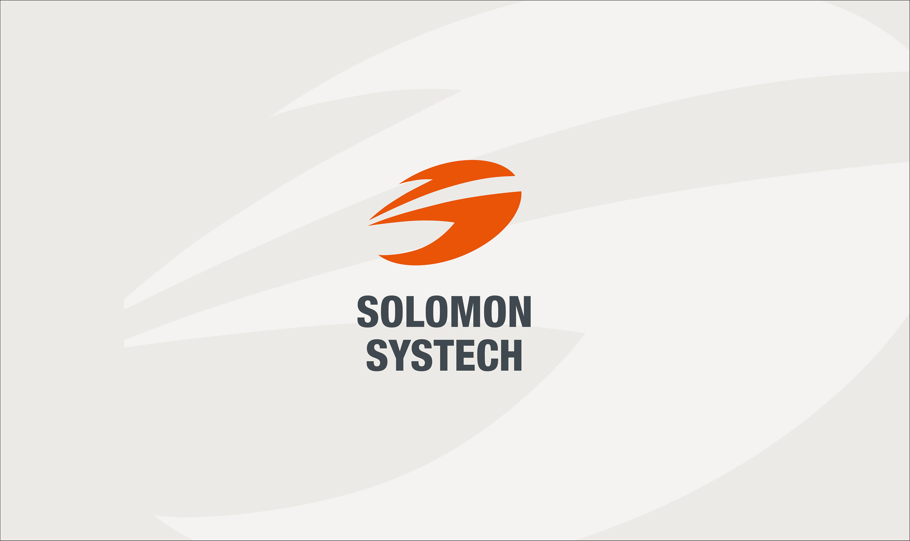
A leading Hong Kong-based semiconductor manufacturer required a new identity in advance of its listing.
The rebranding had to reflect Solomon Systech's leadership in the area of technological miniaturization and convergence as well as its dynamic corporate culture. The
"super S" logo had to be legible and applicable on an extremely small scale, such as the surface of a chip.
"super S" logo had to be legible and applicable on an extremely small scale, such as the surface of a chip.
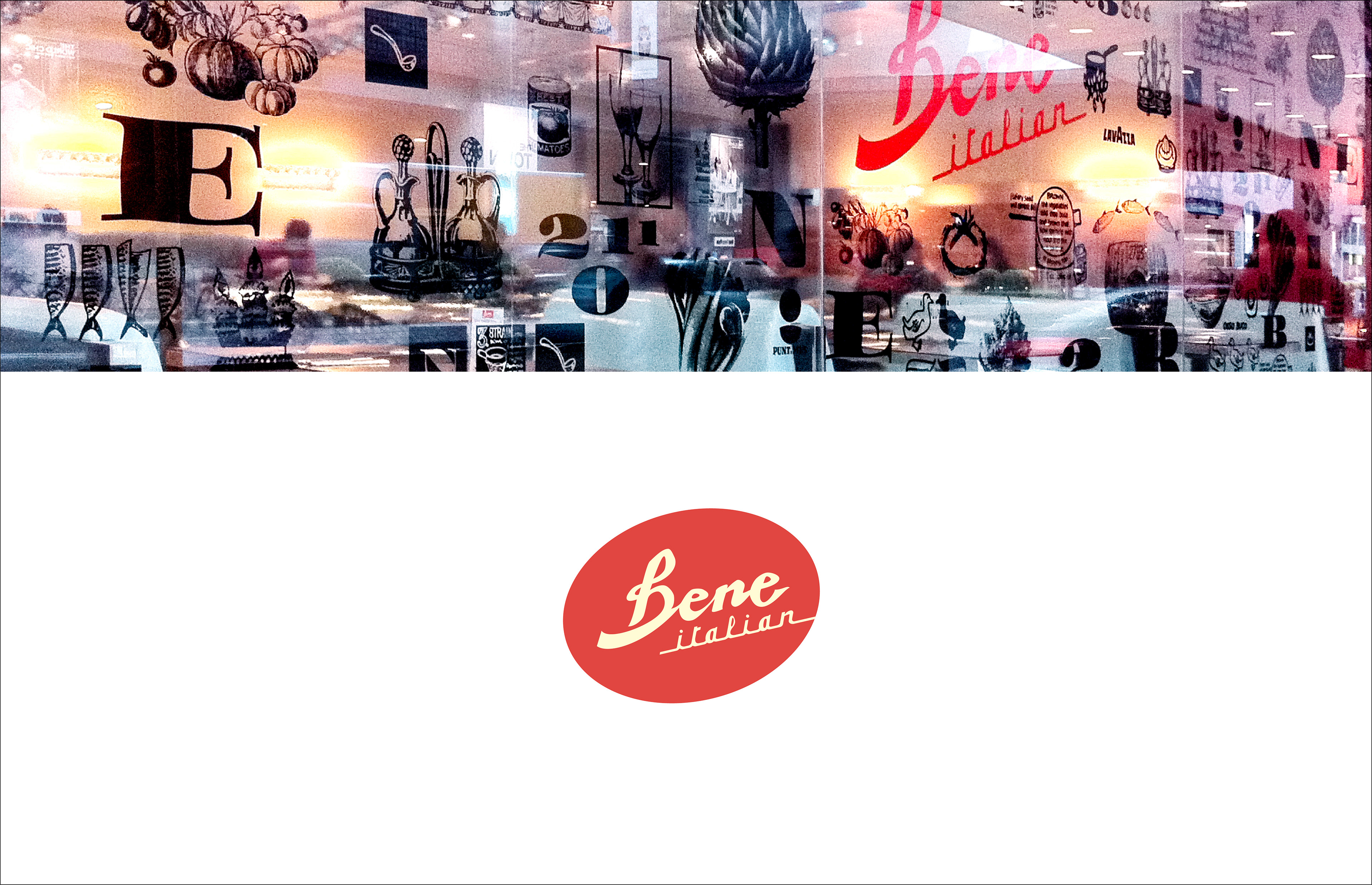
Identity for an Italian eatery serving mainly pizzas and pastas in a local mall.
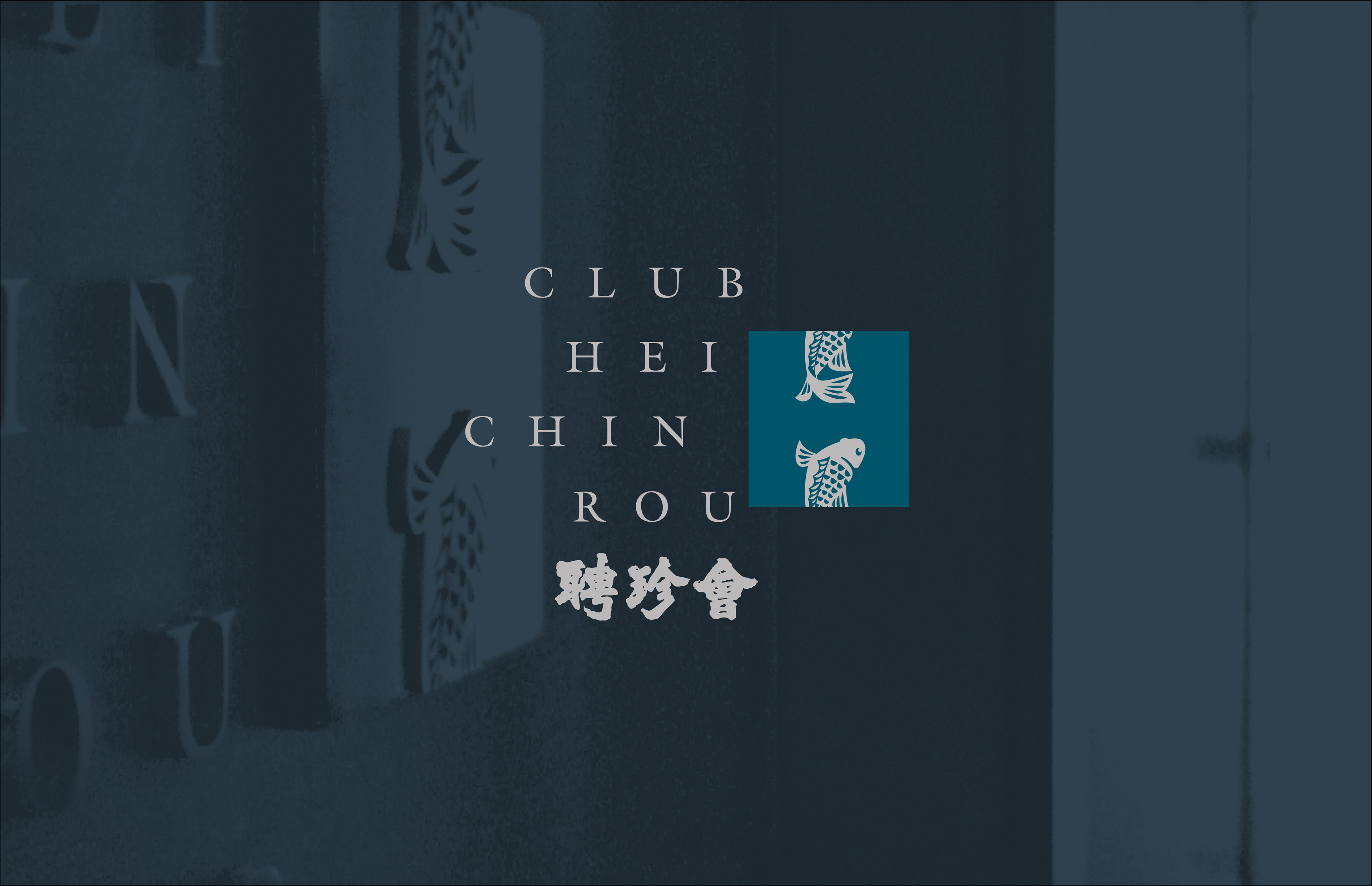
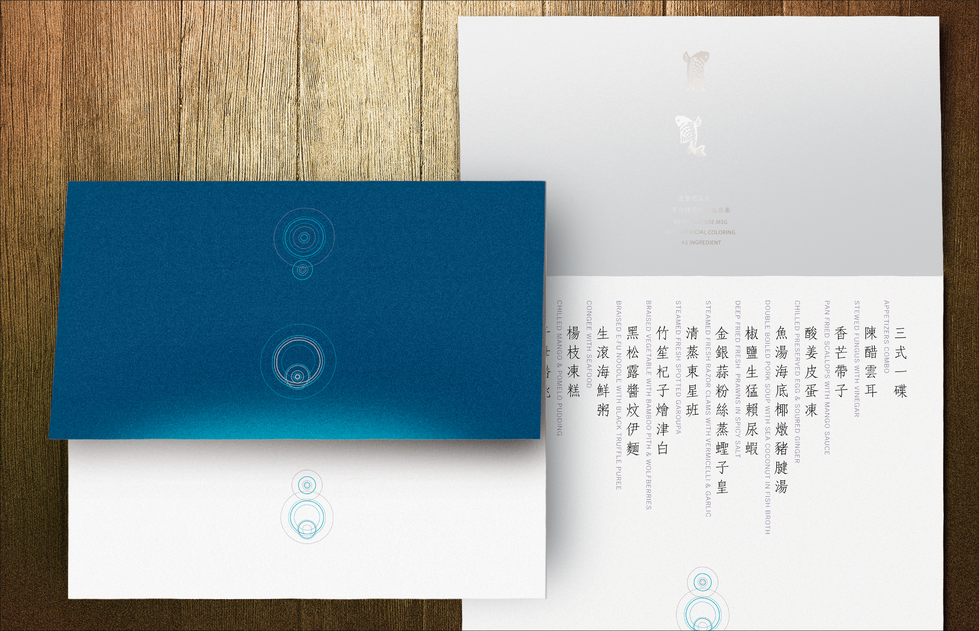
A dining club designed for business entertainment with a signature seafood menu.