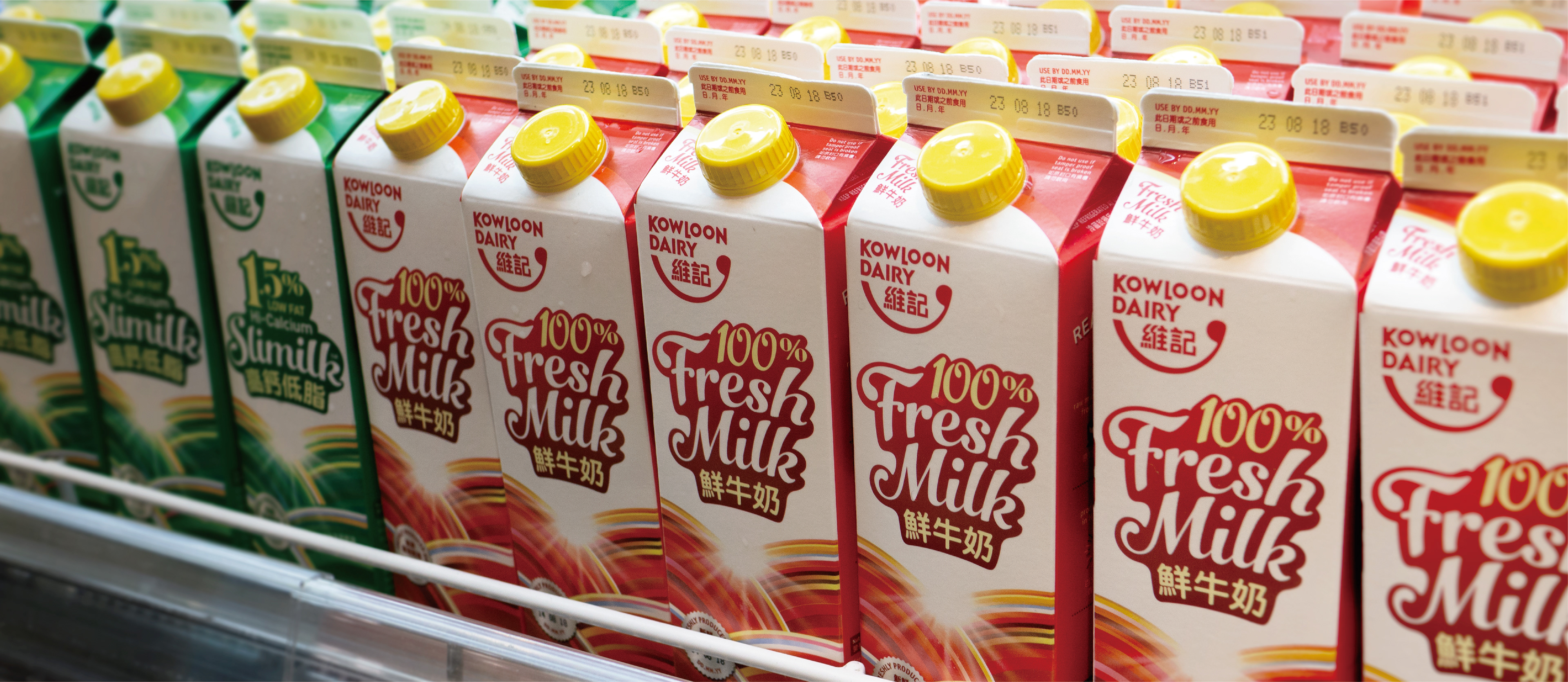
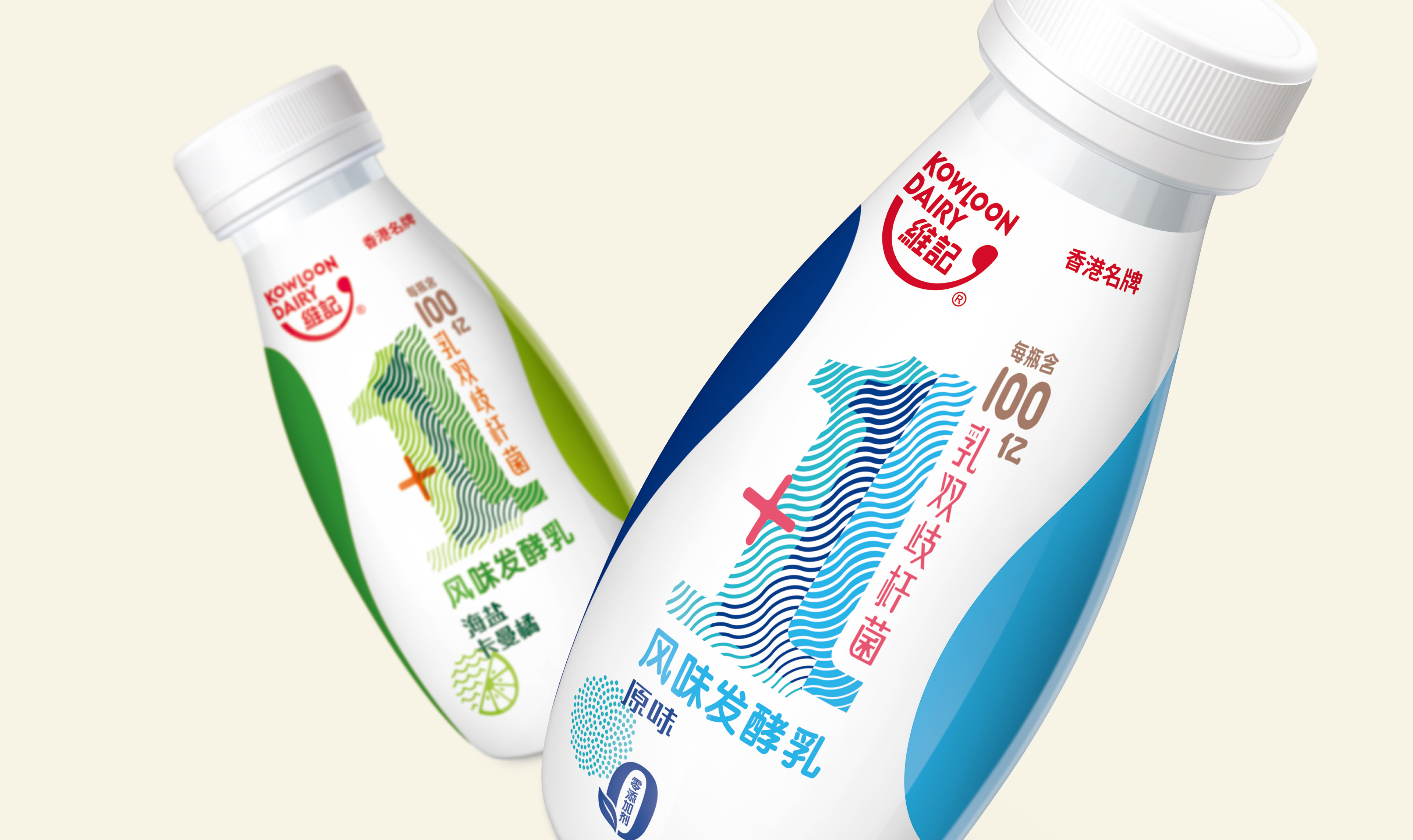
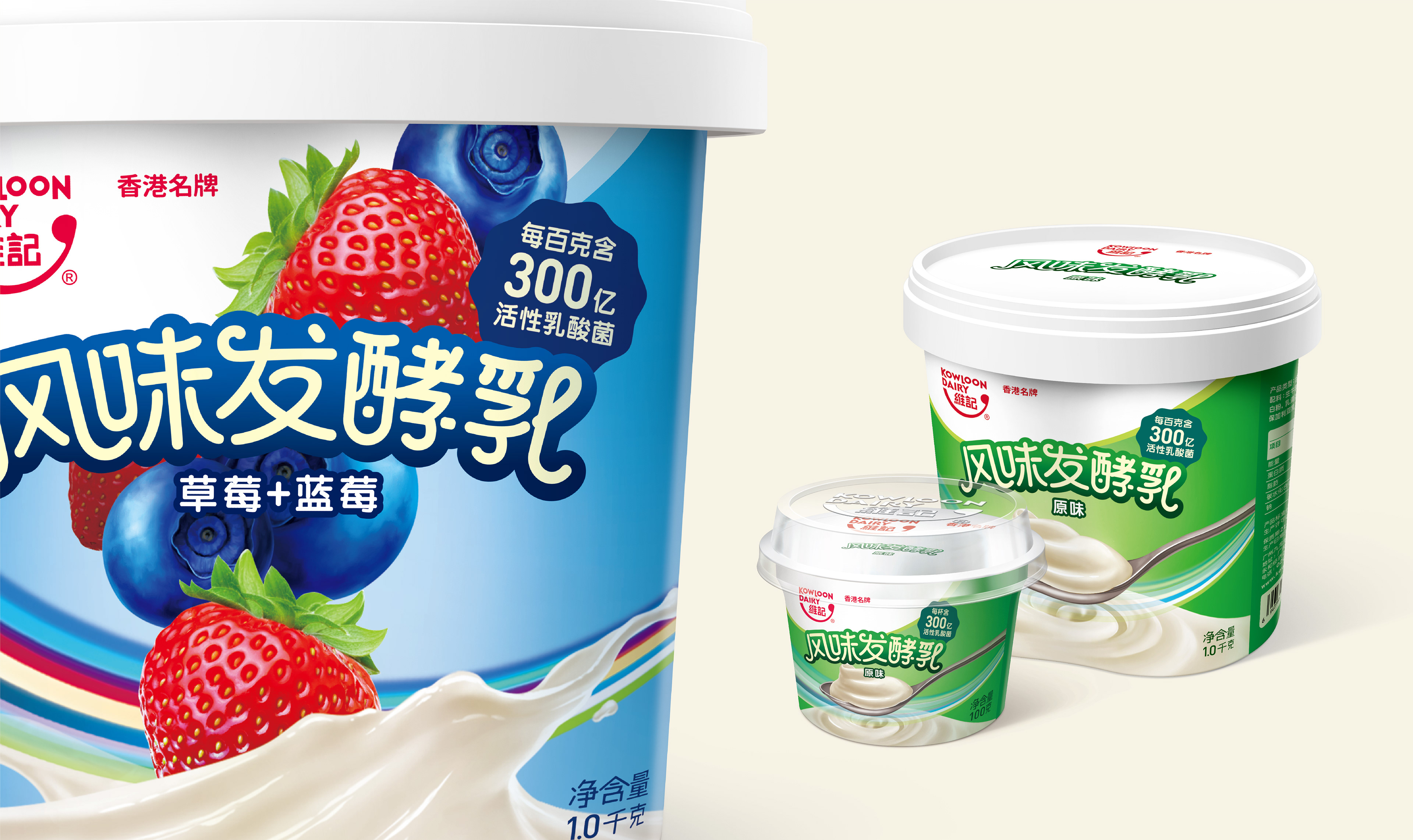
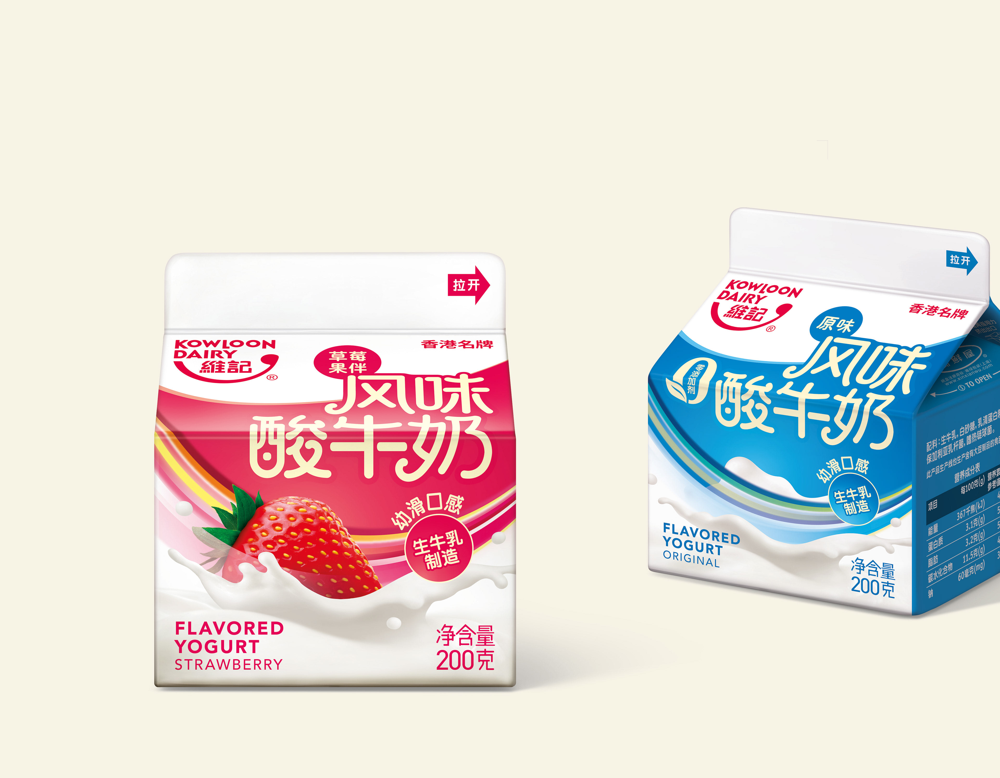
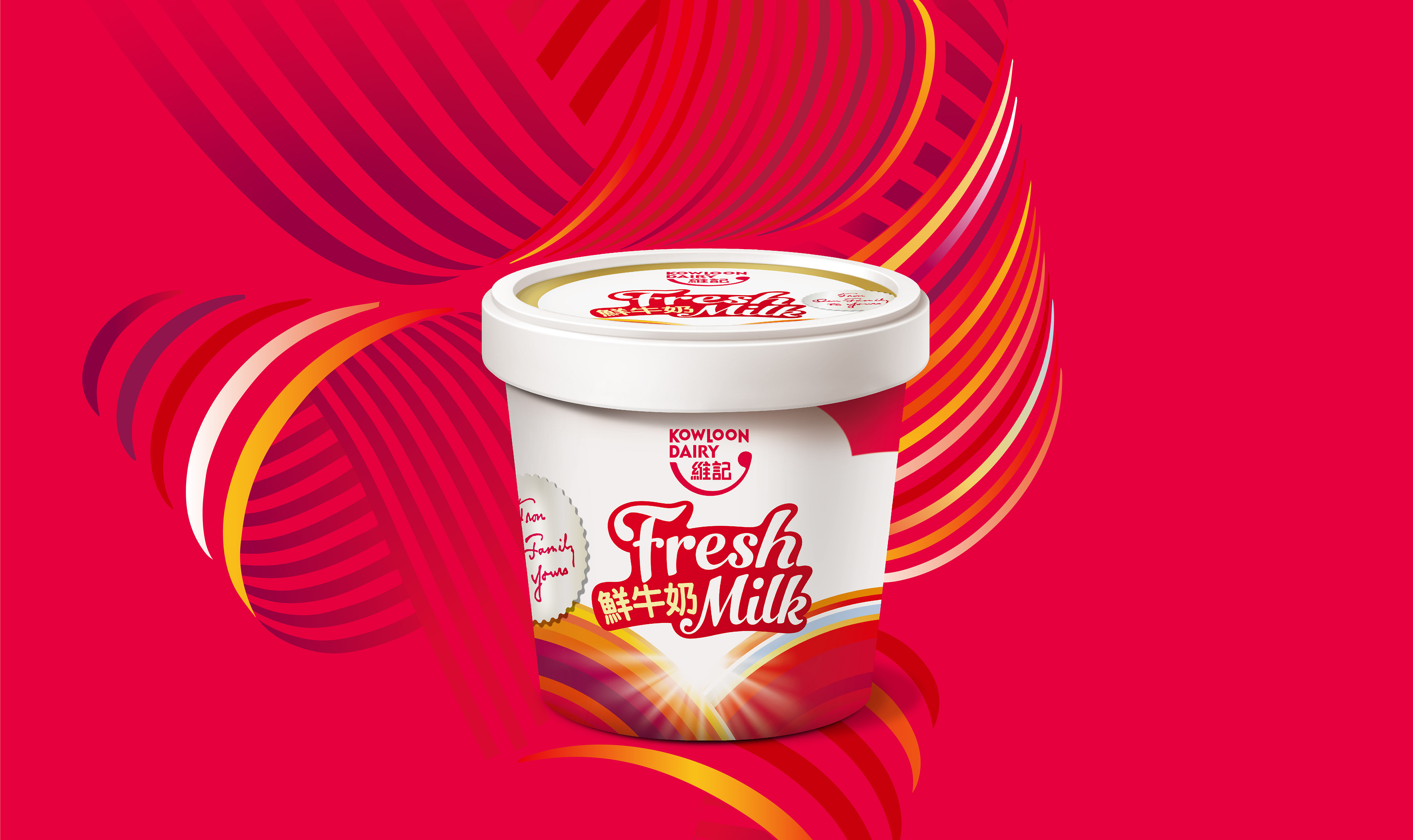
We began by redesigning the brand’s fresh milk product range. Various design directions were explored including heritage, freshness, the iconic glass bottle and a ‘sunrise’ theme based on the existing packaging. A redesign based on the sunrise theme was selected. The graphic treatment was derived from the existing milk cartons, bringing a new dimension to the packaging while ensuring familiarity. The rainbow/sunray graphics serve as a visual identifier for specific milk products. The new design was adopted in both the Hong Kong and China markets.
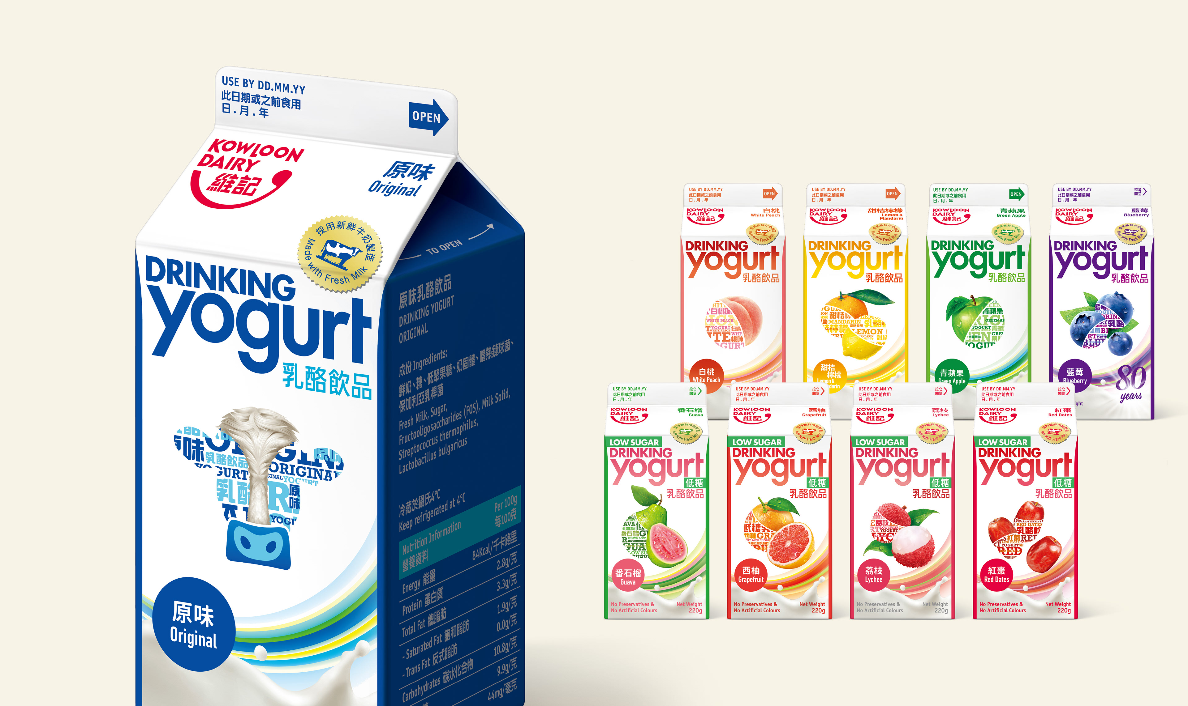
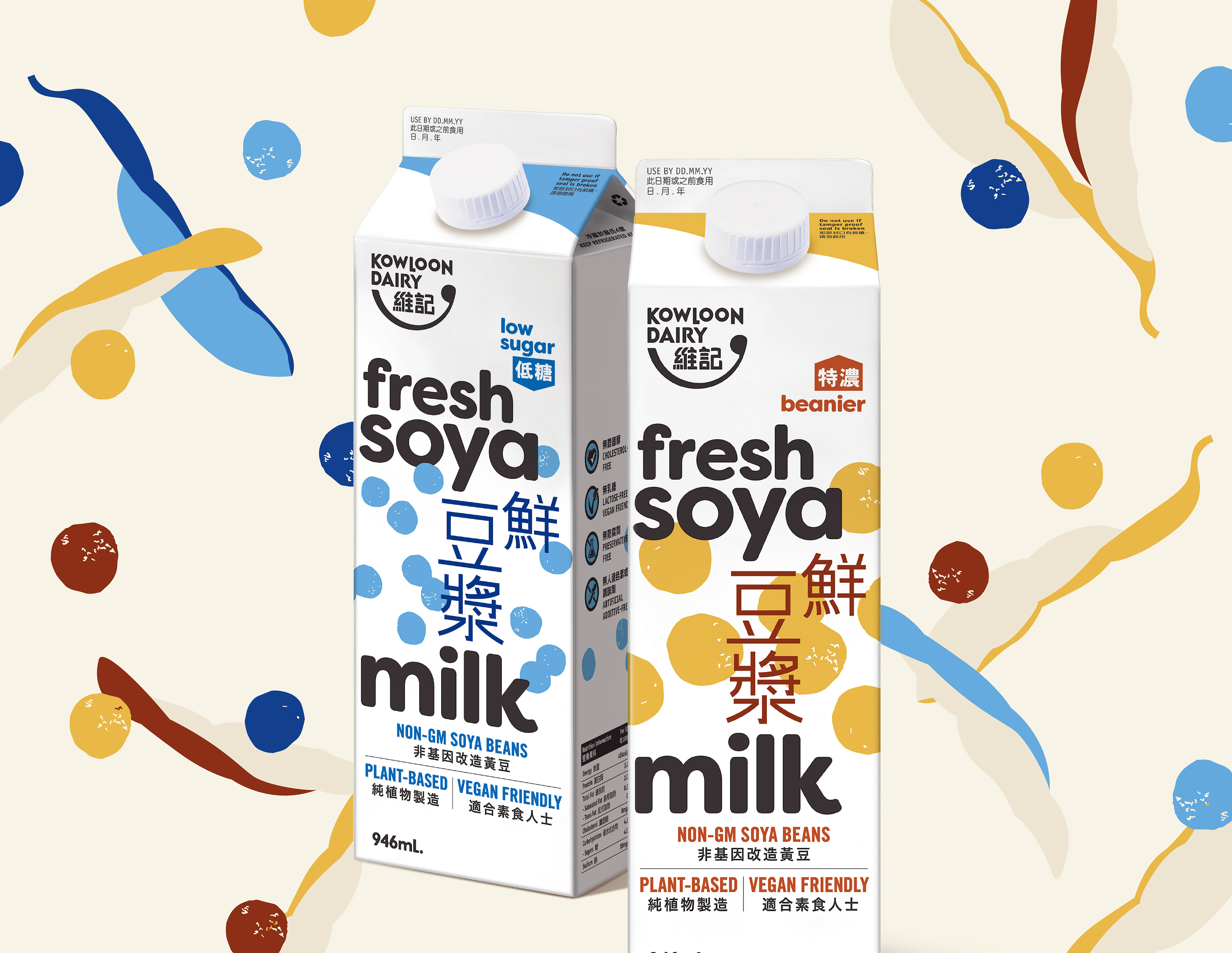
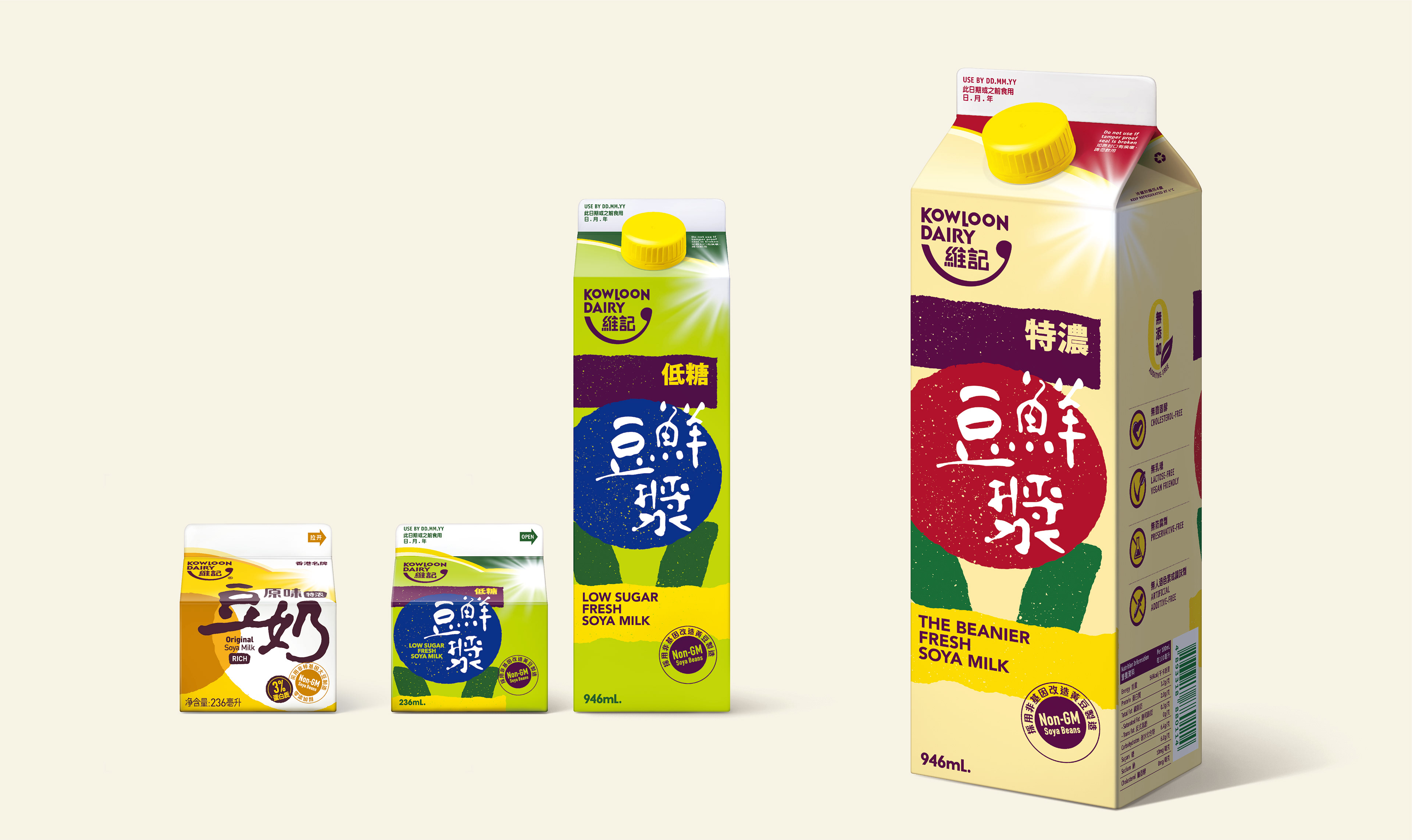
We created the bi-lingual typographical labelling for all of the products including soy bean milk and yoghurt.

A whole new ‘swirl’
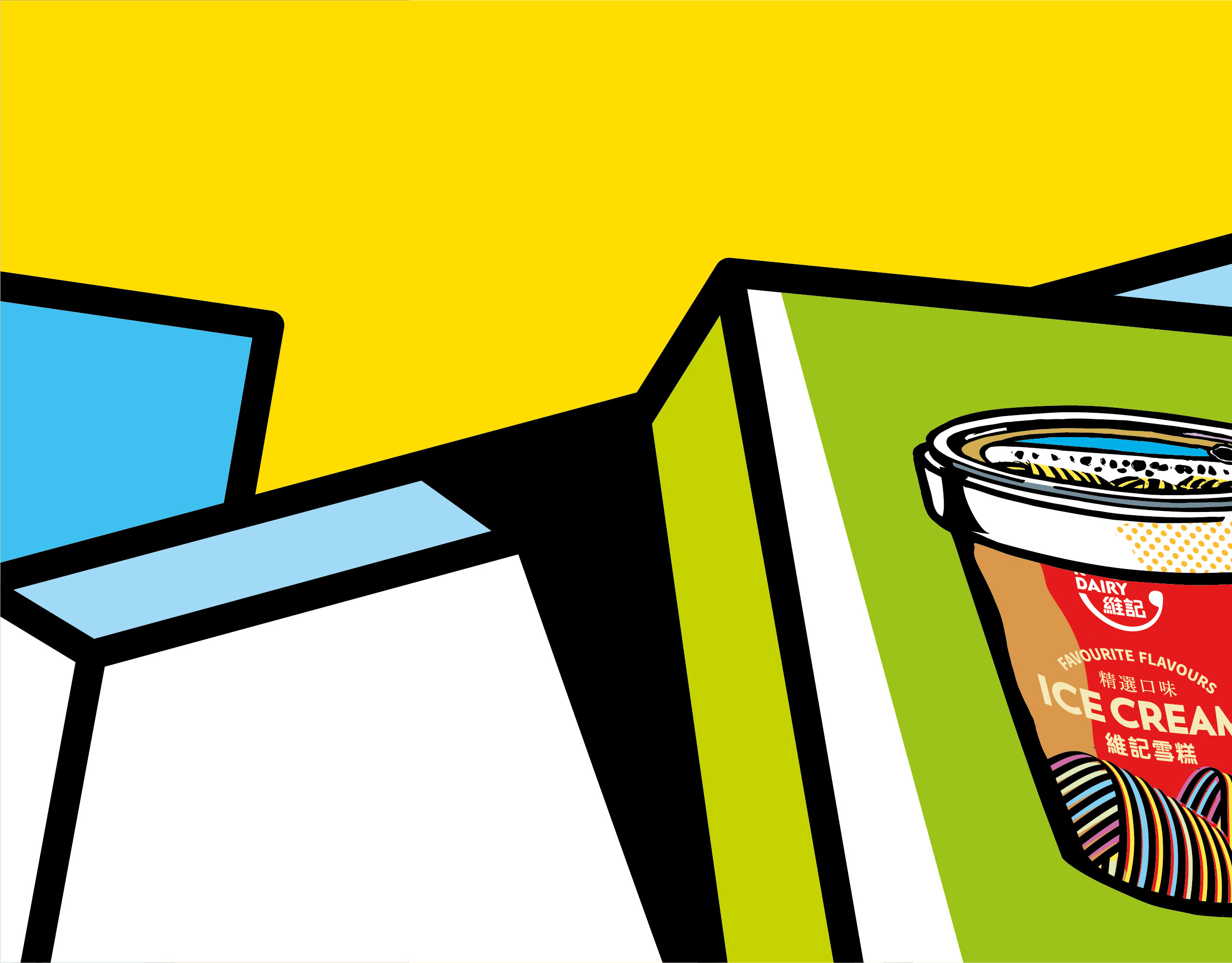
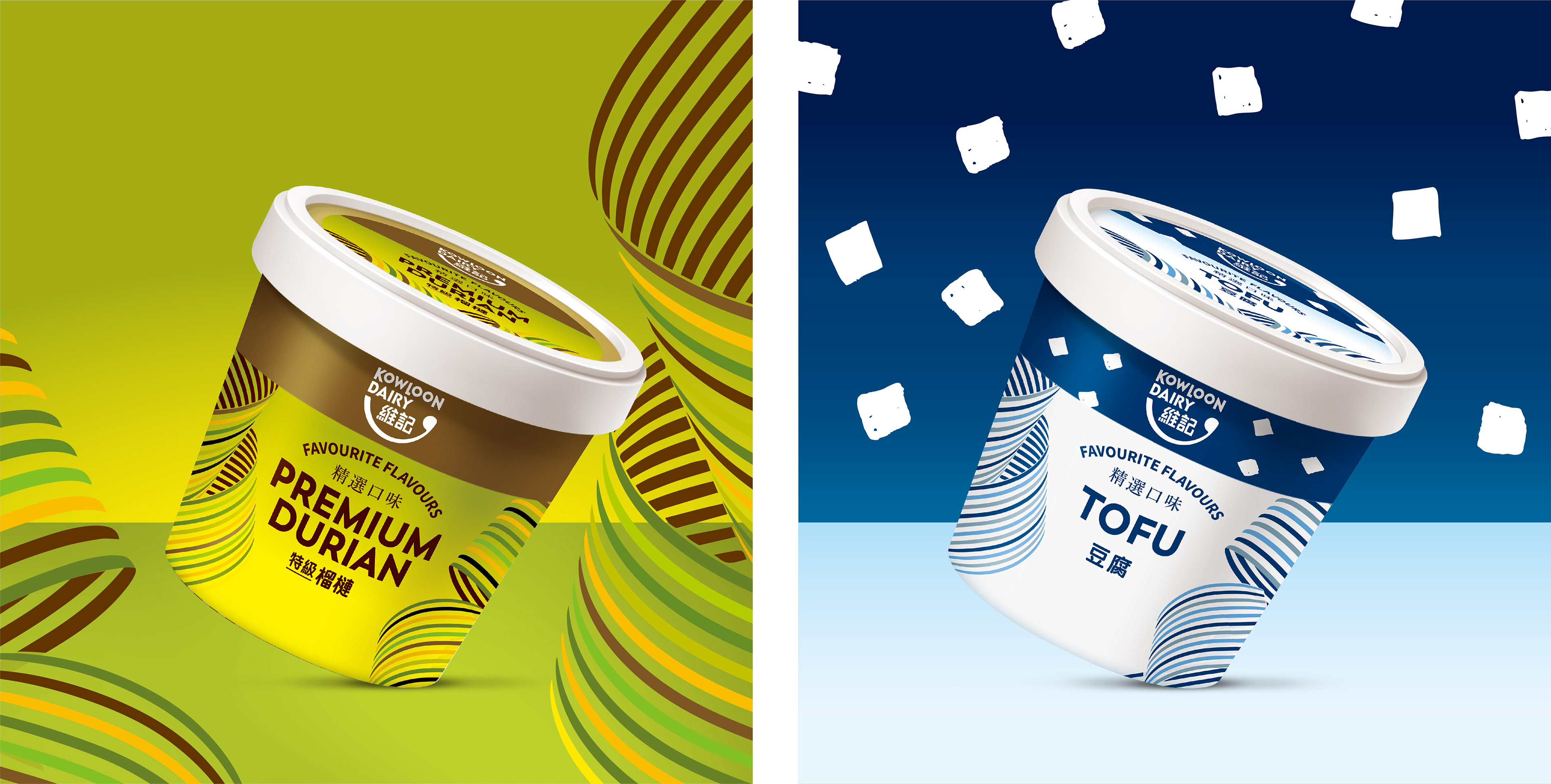
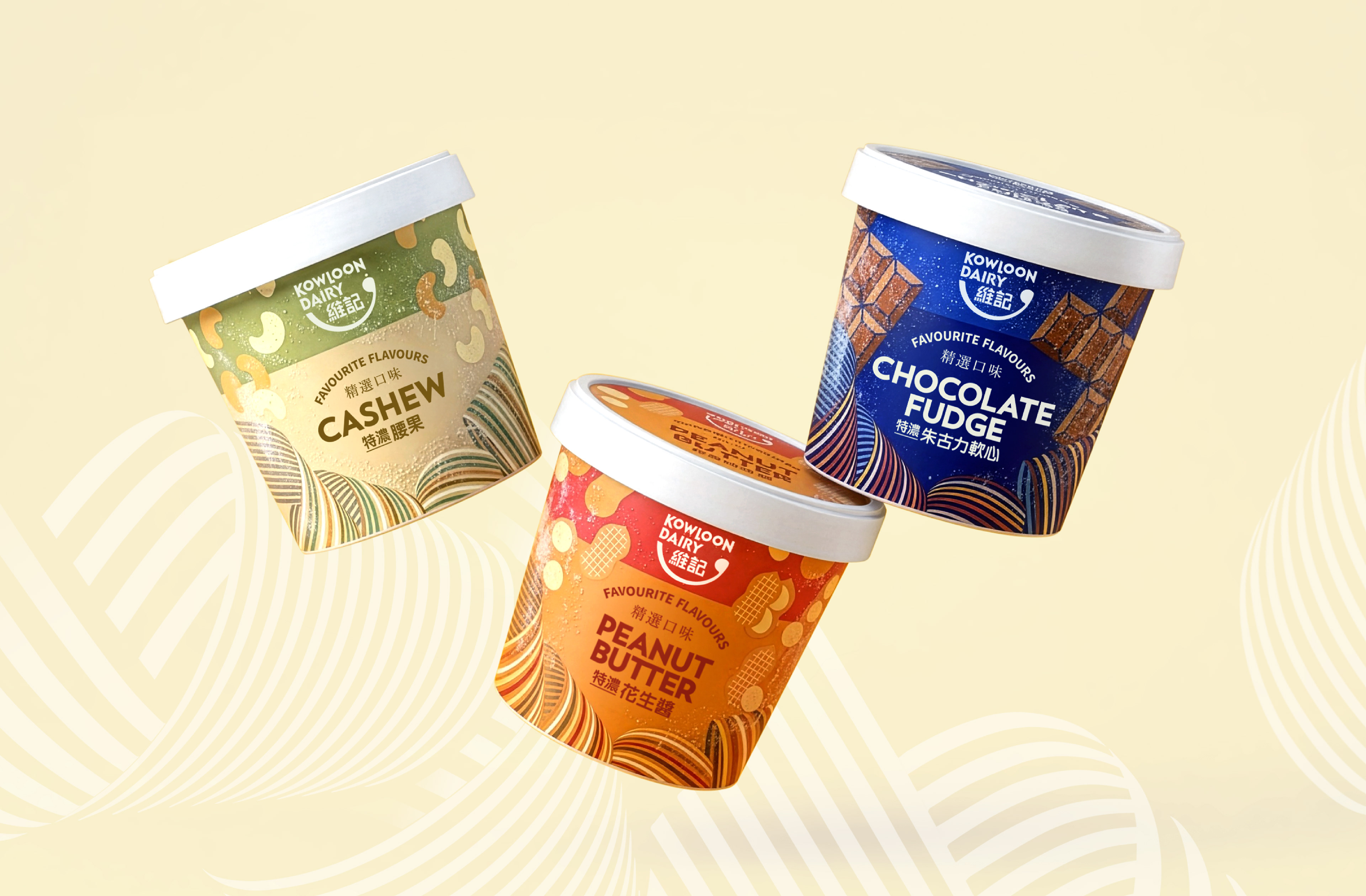
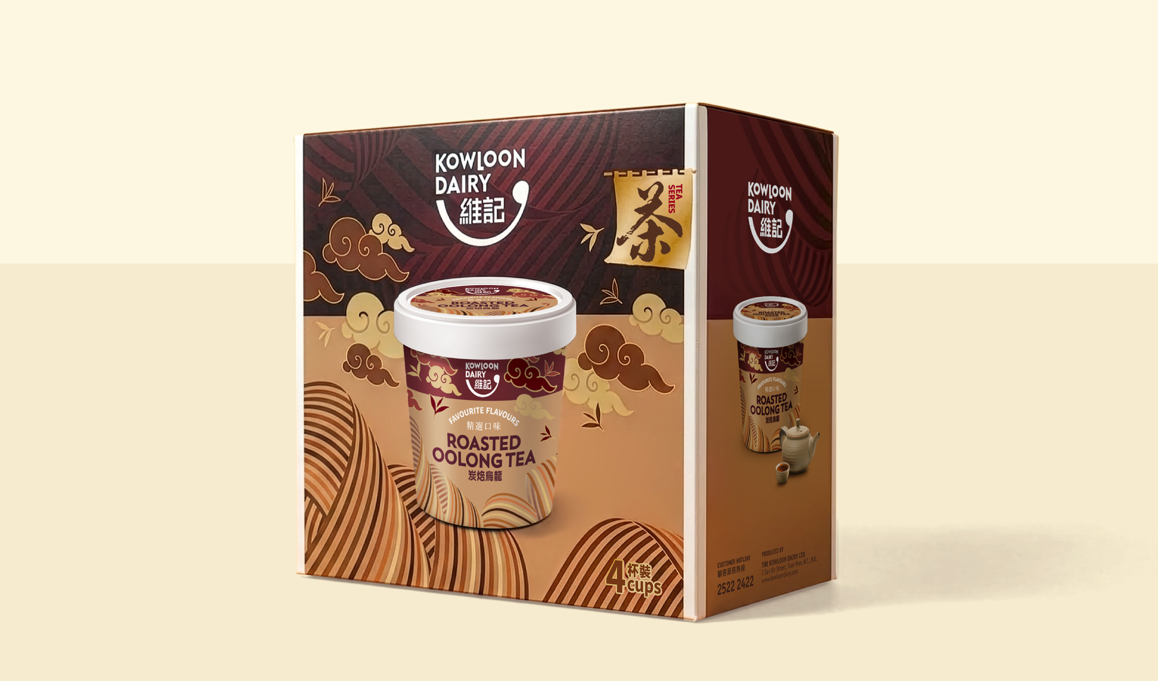
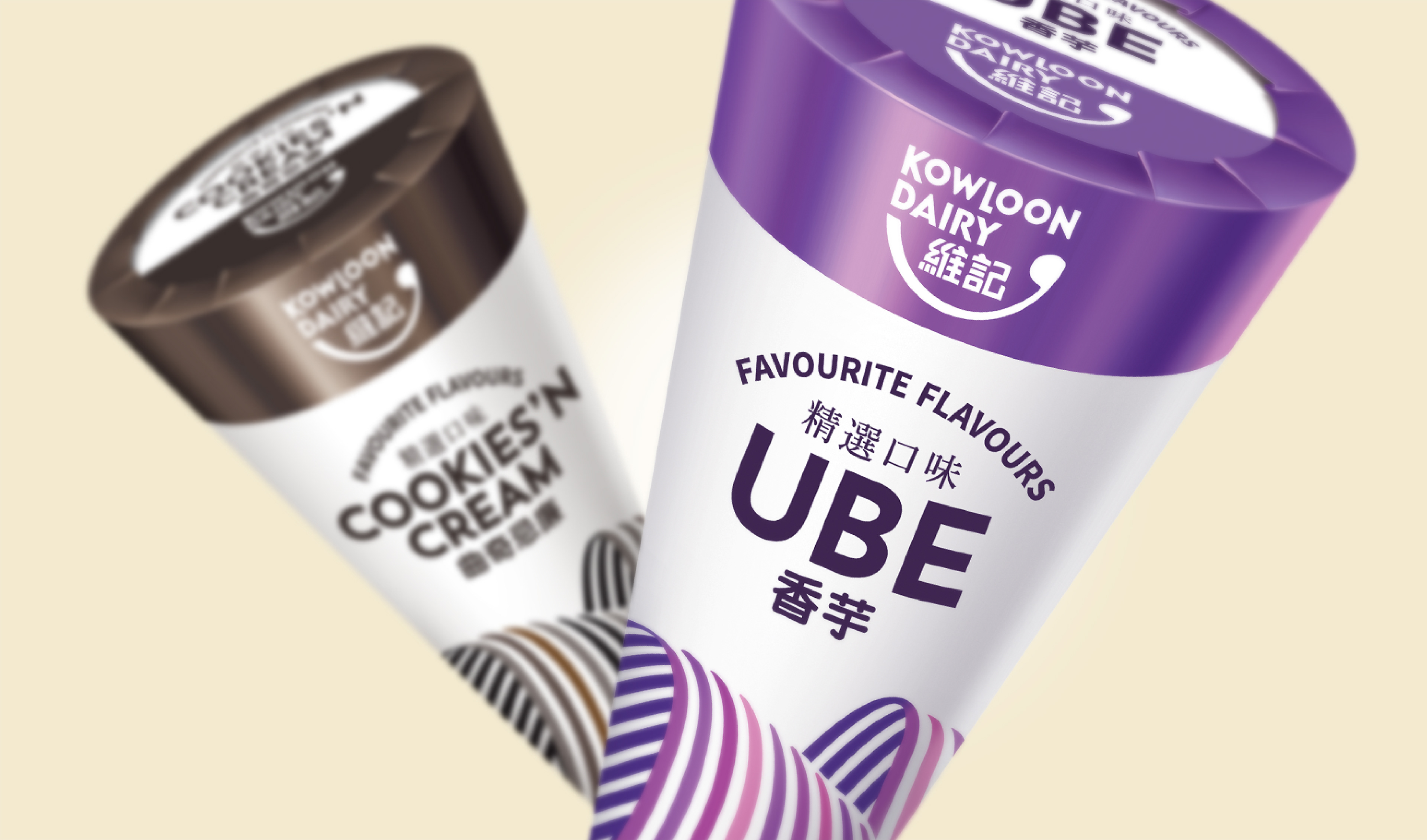
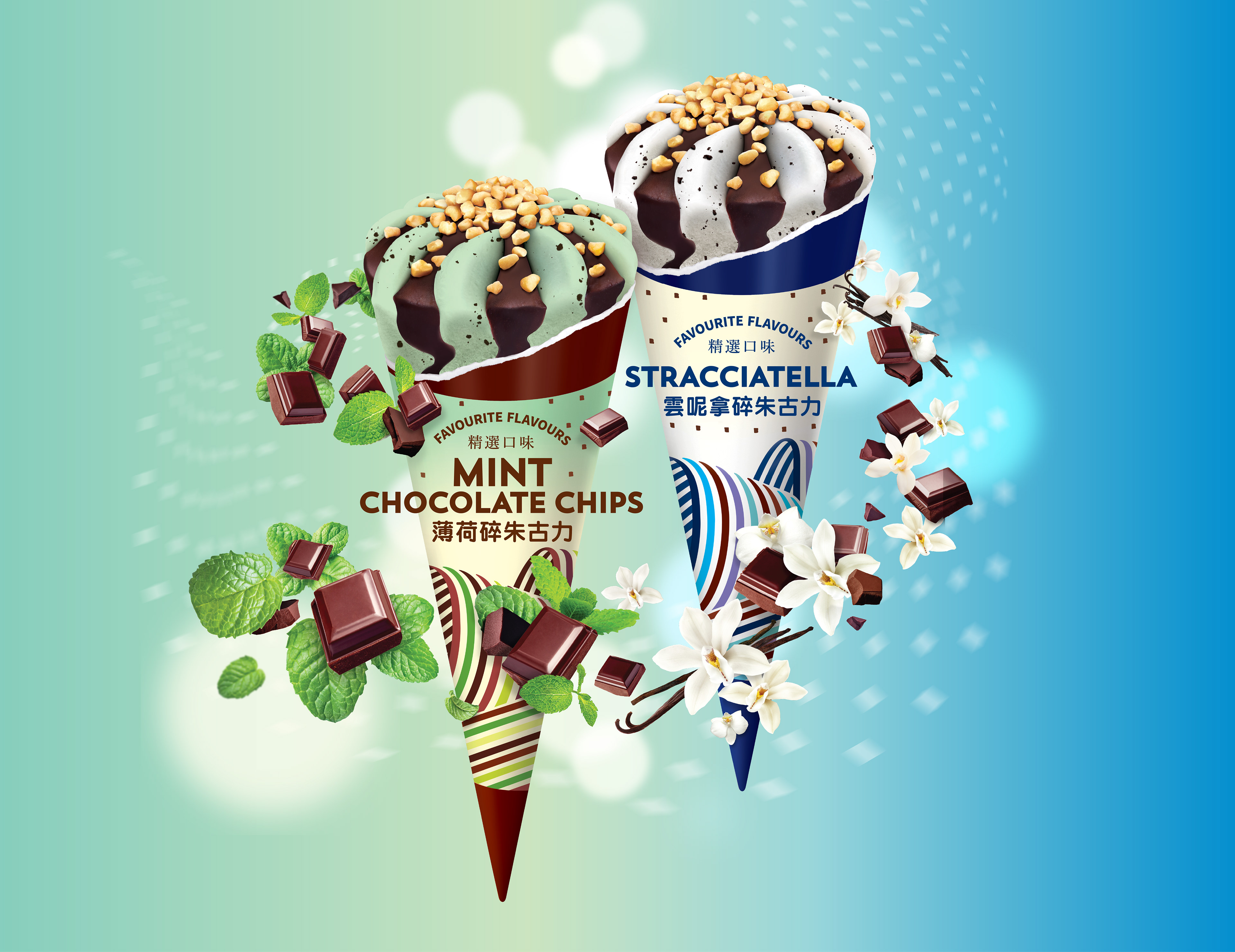
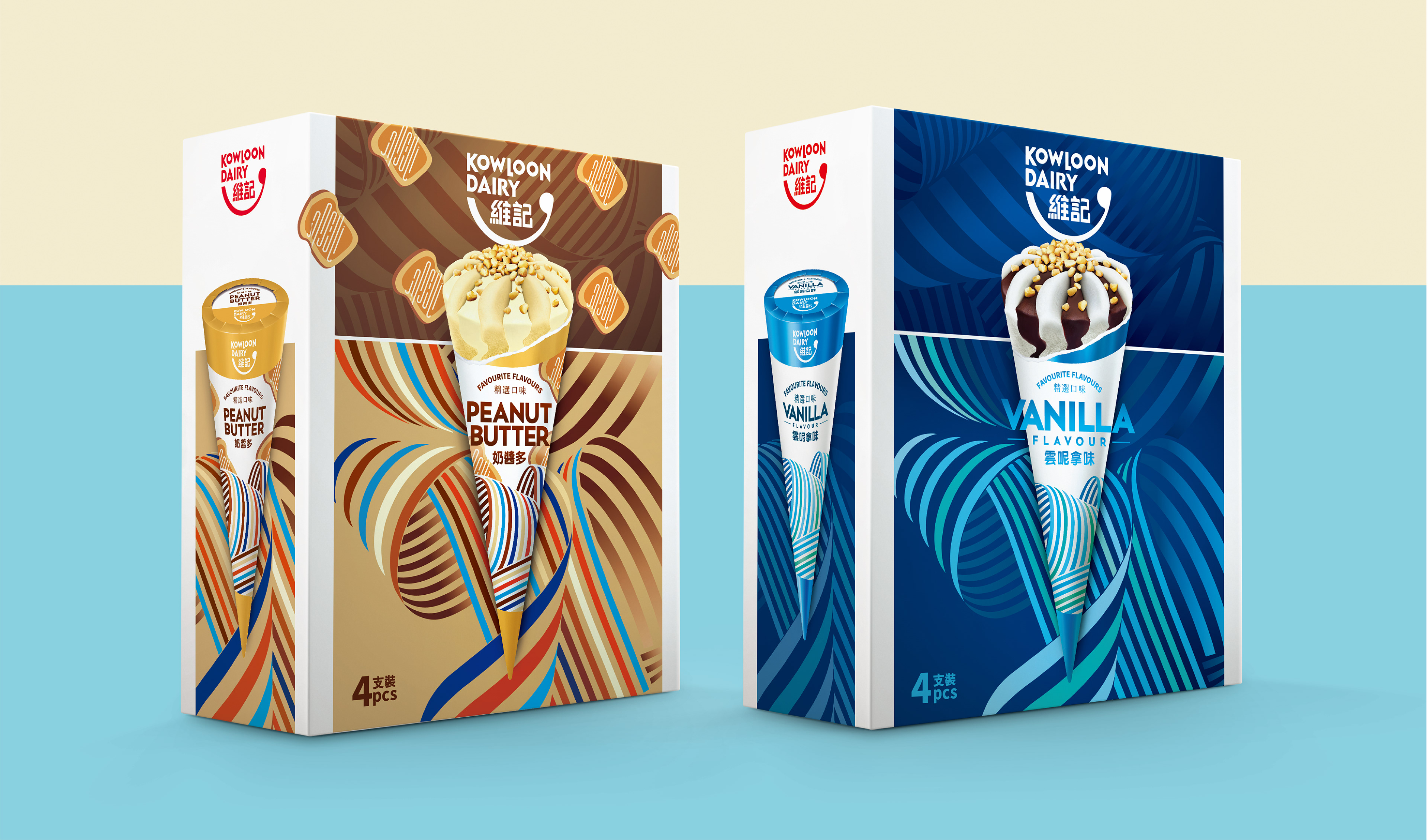
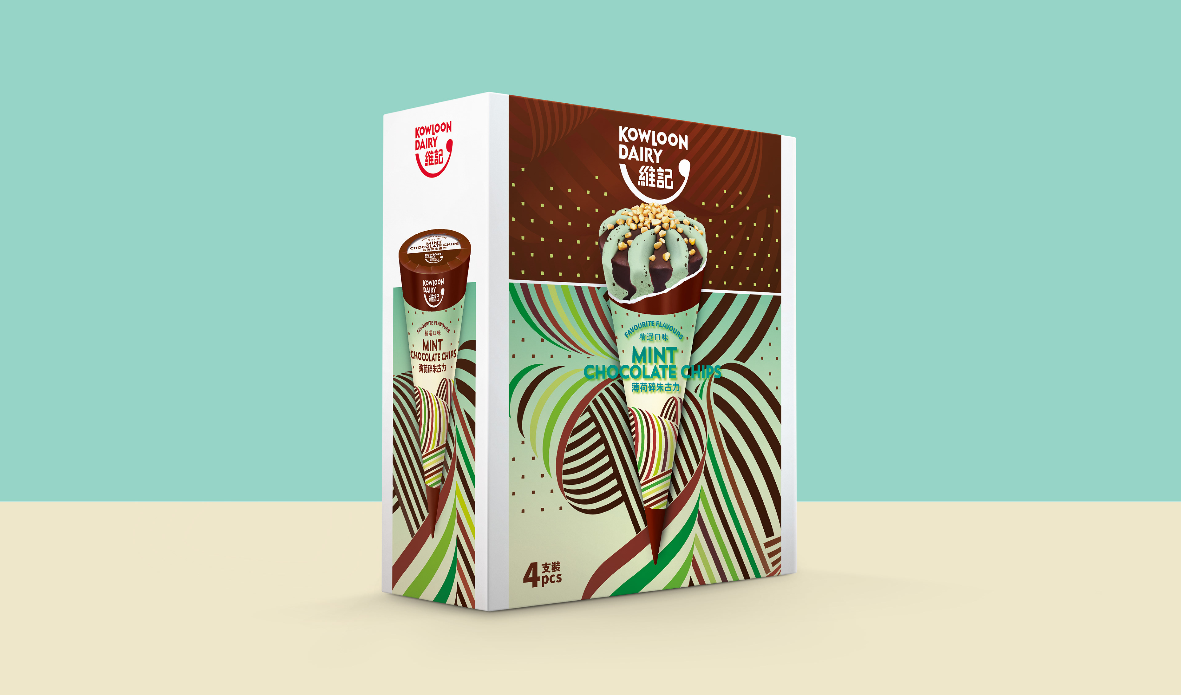
The brief for redesigning Kowloon Dairy’s ice cream packaging was to create an image expressing the high quality of the product and to reposition it as a local premium brand. The new packaging design had to blend in with the overall re-branding for Kowloon Dairy. Several visual directions were explored, with the ‘swirls’ concept selected — an evolution of the milk packaging rainbow stripes into swirling patterns suggesting the texture and richness of ice cream. The visual theme was applied to packaging for ice cream cones and cups and for Kowloon Dairy ‘limited edition’ ice creams in seasonal flavors.
The brief for redesigning Kowloon Dairy’s ice cream packaging was to create an image expressing the high quality of the product and to reposition it as a local premium brand. The new packaging design had to blend in with the overall re-branding for Kowloon Dairy. Several visual directions were explored, with the ‘swirls’ concept selected — an evolution of the milk packaging rainbow stripes into swirling patterns suggesting the texture and richness of ice cream. The visual theme was applied to packaging for ice cream cones and cups and for Kowloon Dairy ‘limited edition’ ice creams in seasonal flavors.
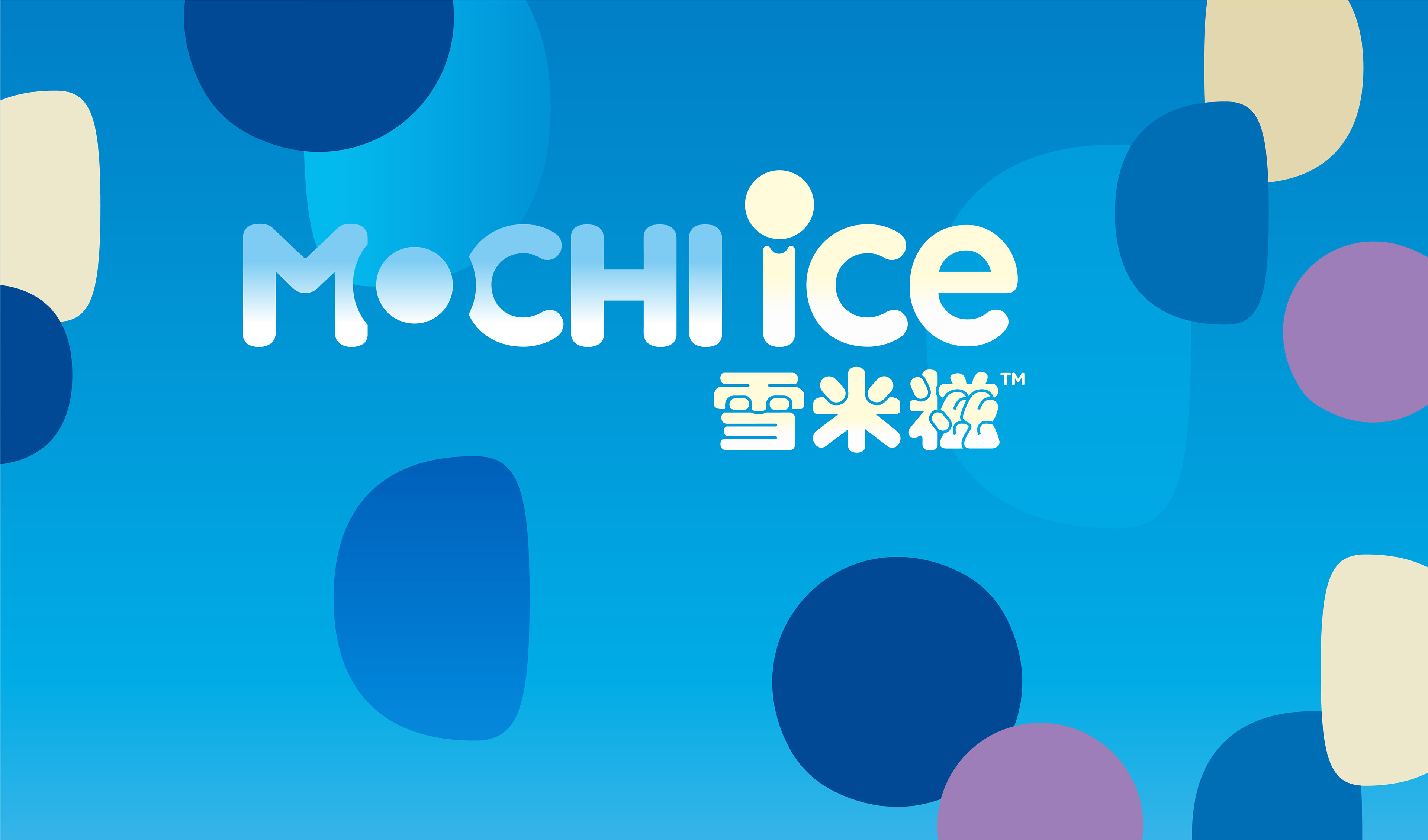
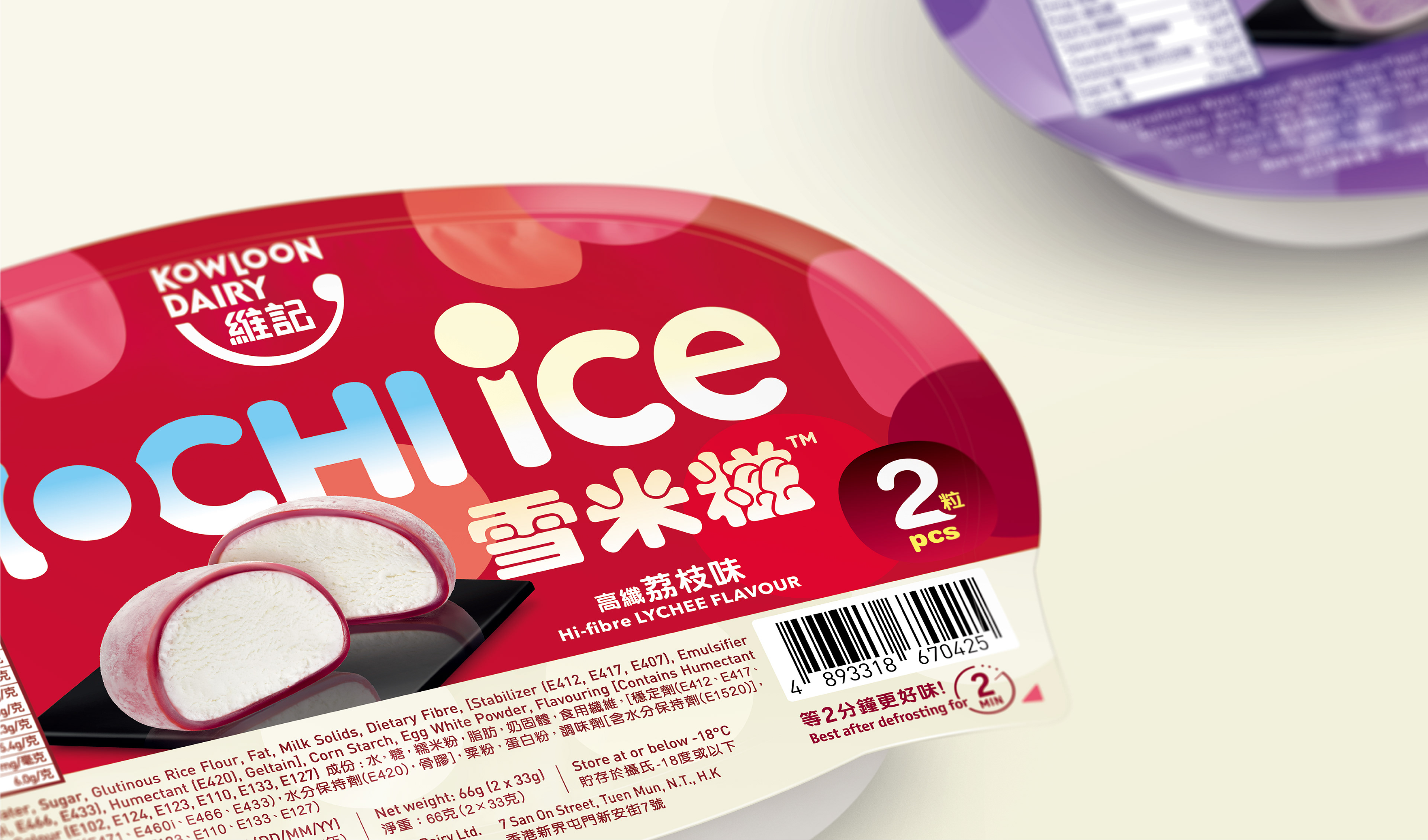
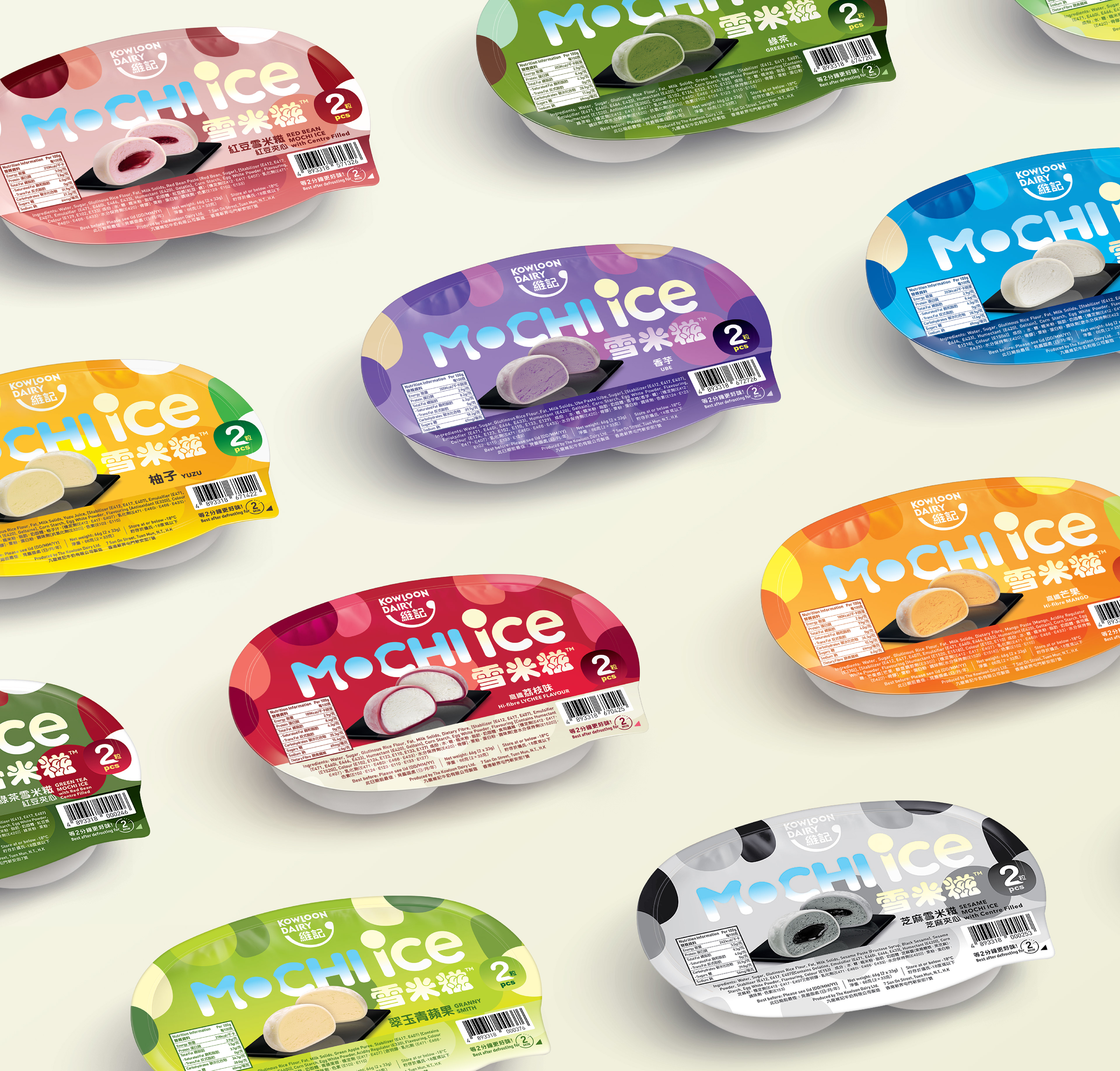
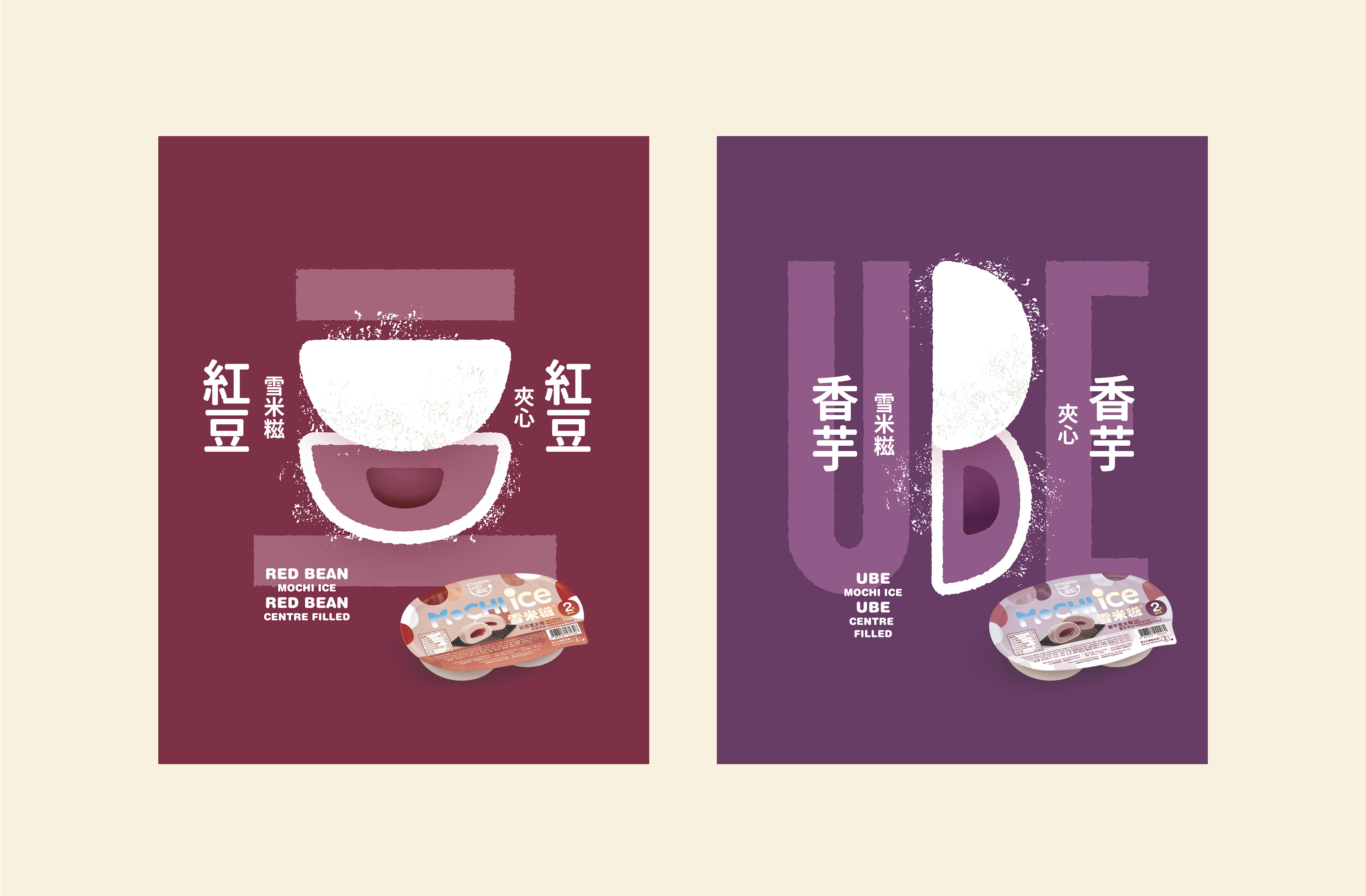
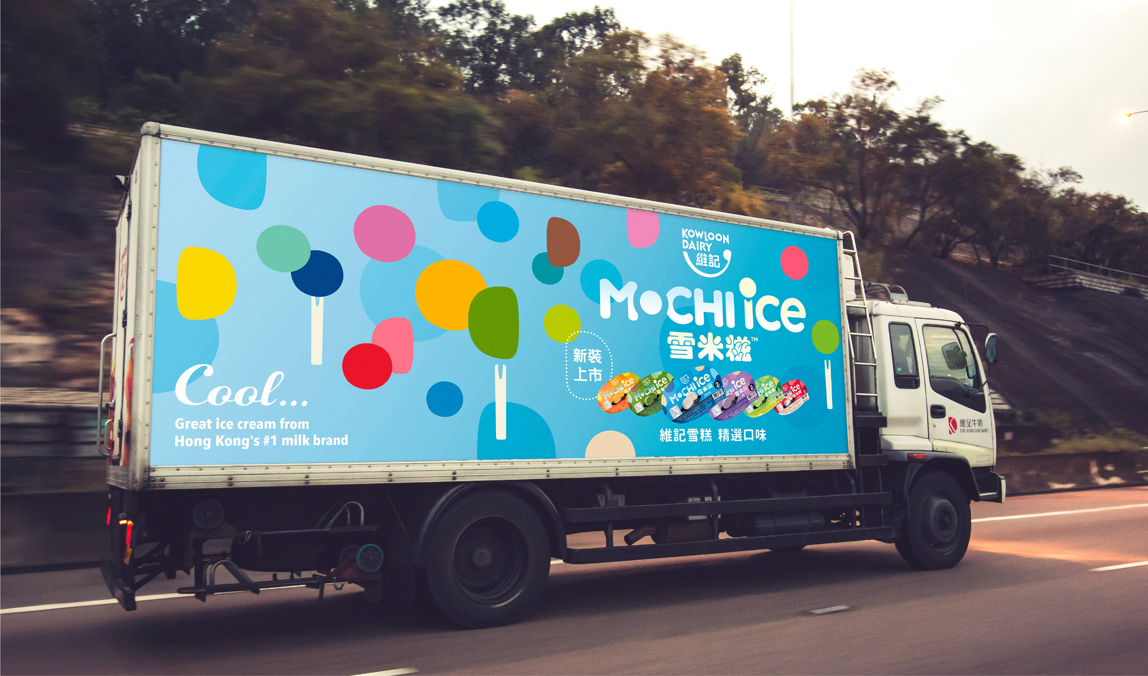
Kowloon Dairy’s Mochi Ice 雪米糍
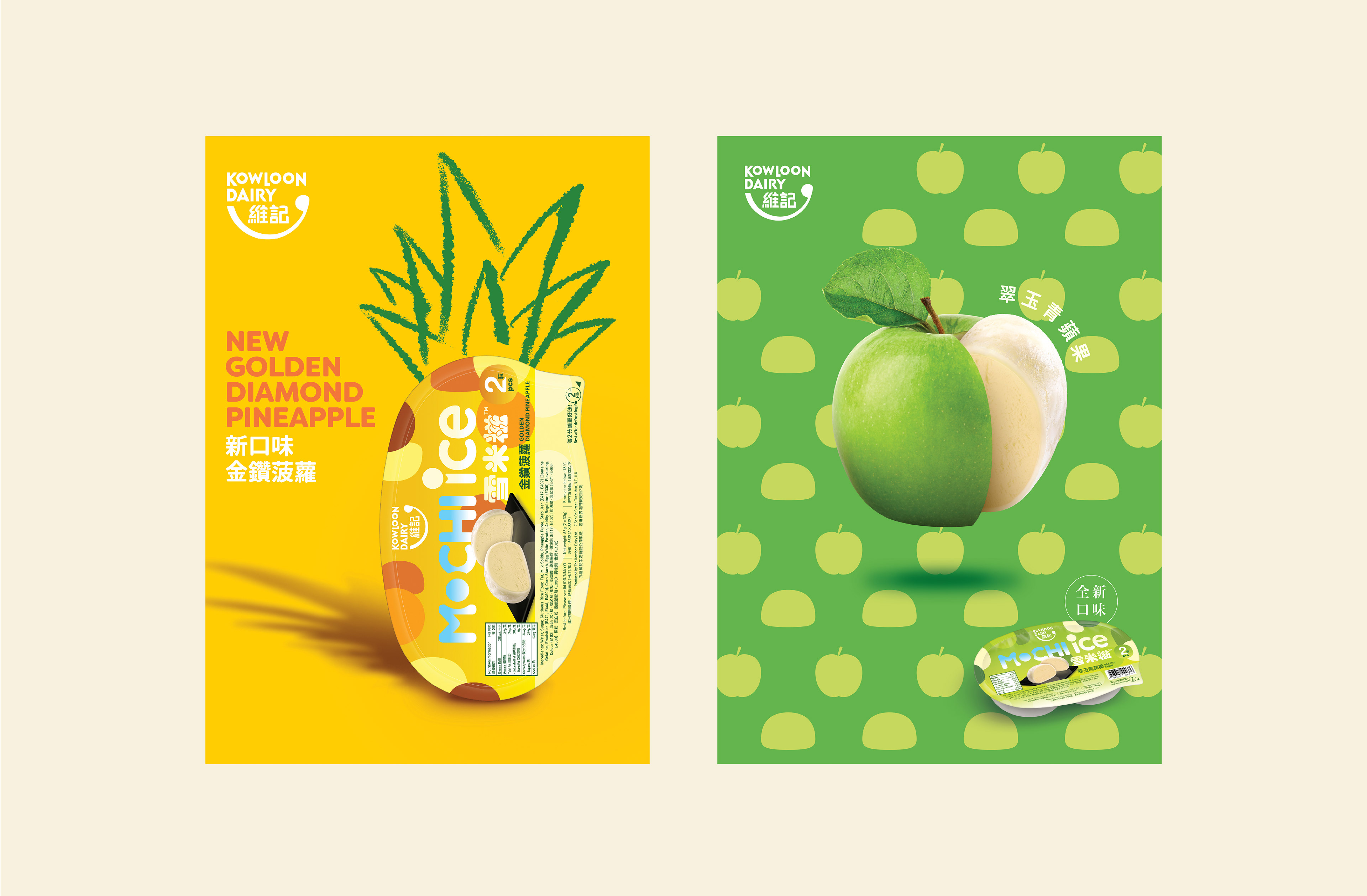
This product line is a Japanese-inspired ice cream dessert in a growing variety of flavors. A sub-brand of Kowloon Dairy ice cream, Mochi Ice has been a popular brand since the 1990s — affordable, fun and particularly appealing to students and younger consumers. Mochi Ice needed a redesign of its packaging aligned with Kowloon Dairy’s overall rebranding. The challenge was to design an English logotype while retaining the patented Chinese name, which has high recall value.
This product line is a Japanese-inspired ice cream dessert in a growing variety of flavors. A sub-brand of Kowloon Dairy ice cream, Mochi Ice has been a popular brand since the 1990s — affordable, fun and particularly appealing to students and younger consumers. Mochi Ice needed a redesign of its packaging aligned with Kowloon Dairy’s overall rebranding. The challenge was to design an English logotype while retaining the patented Chinese name, which has high recall value.
A ‘wallpaper’ graphic solution was created using a grid of full- and half-circle Mochi Ice shapes in colours relating to individual flavours.