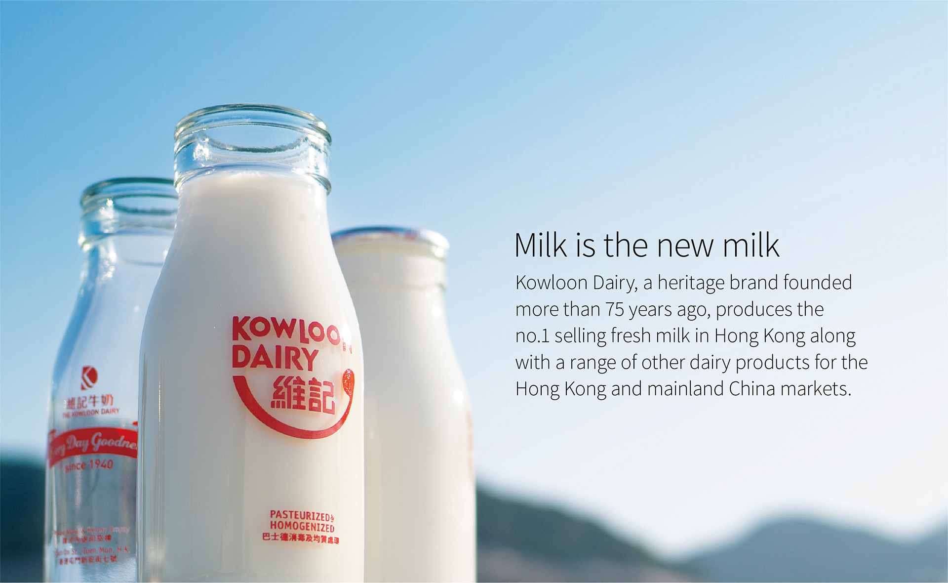
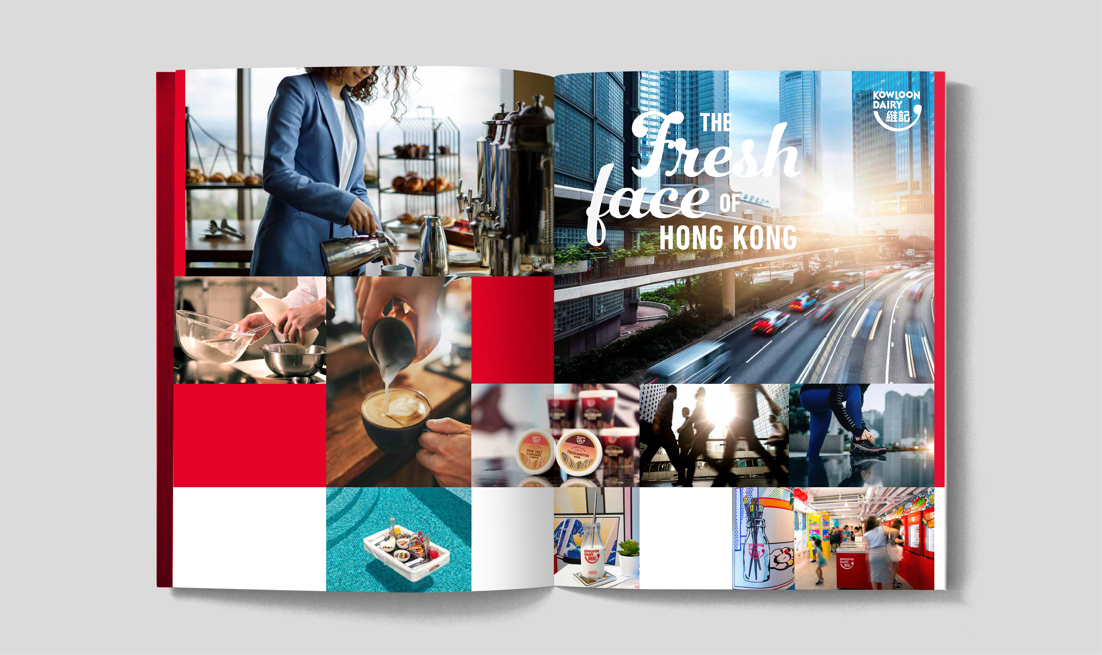
In response to growing competition from local and imported brands and changing consumer tastes, LTD was commissioned to redesign Kowloon Dairy’s corporate and brand identities and the packaging for its entire product range, from milks to ice creams to yogurts.
New bilingual identities
Consumers often confused Kowloon Dairy’s Chinese name with that of other local brands. Moreover, market research showed that the corporate logo, which was being used on all product packaging, did not resonate with consumers. New, clearly distinct, bilingual corporate and brand identities would have to address both of these problems.
Consumers often confused Kowloon Dairy’s Chinese name with that of other local brands. Moreover, market research showed that the corporate logo, which was being used on all product packaging, did not resonate with consumers. New, clearly distinct, bilingual corporate and brand identities would have to address both of these problems.
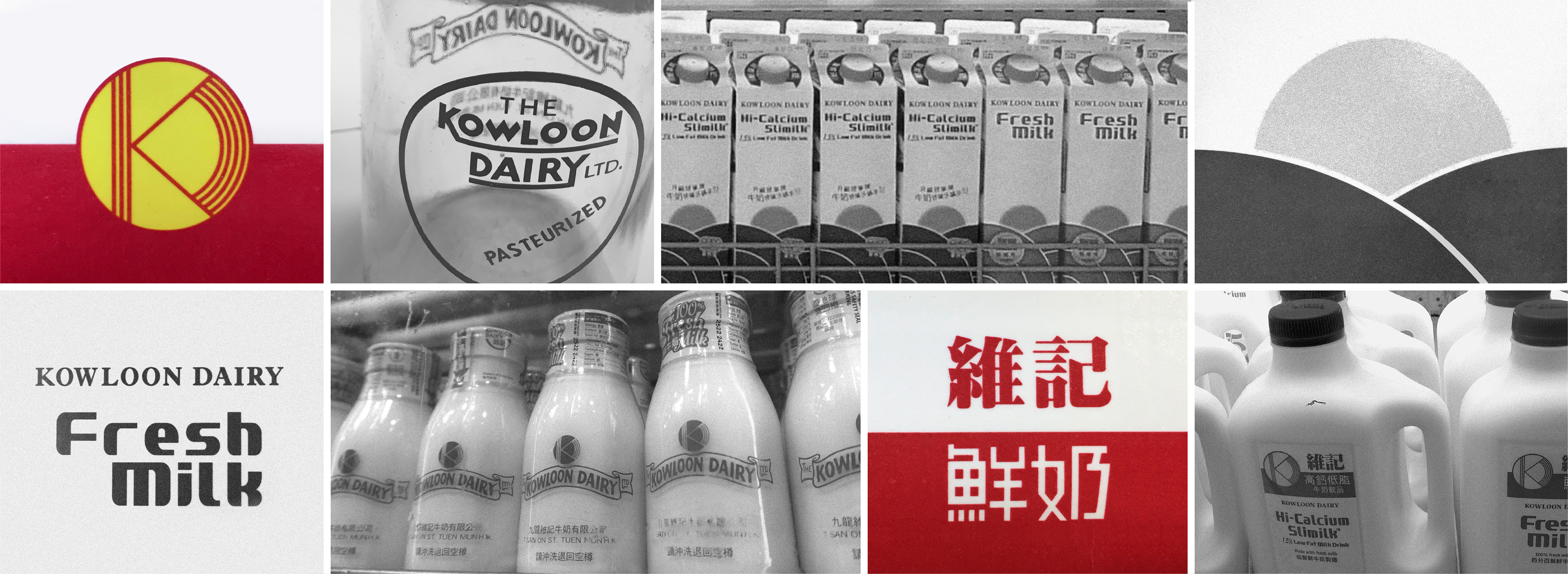
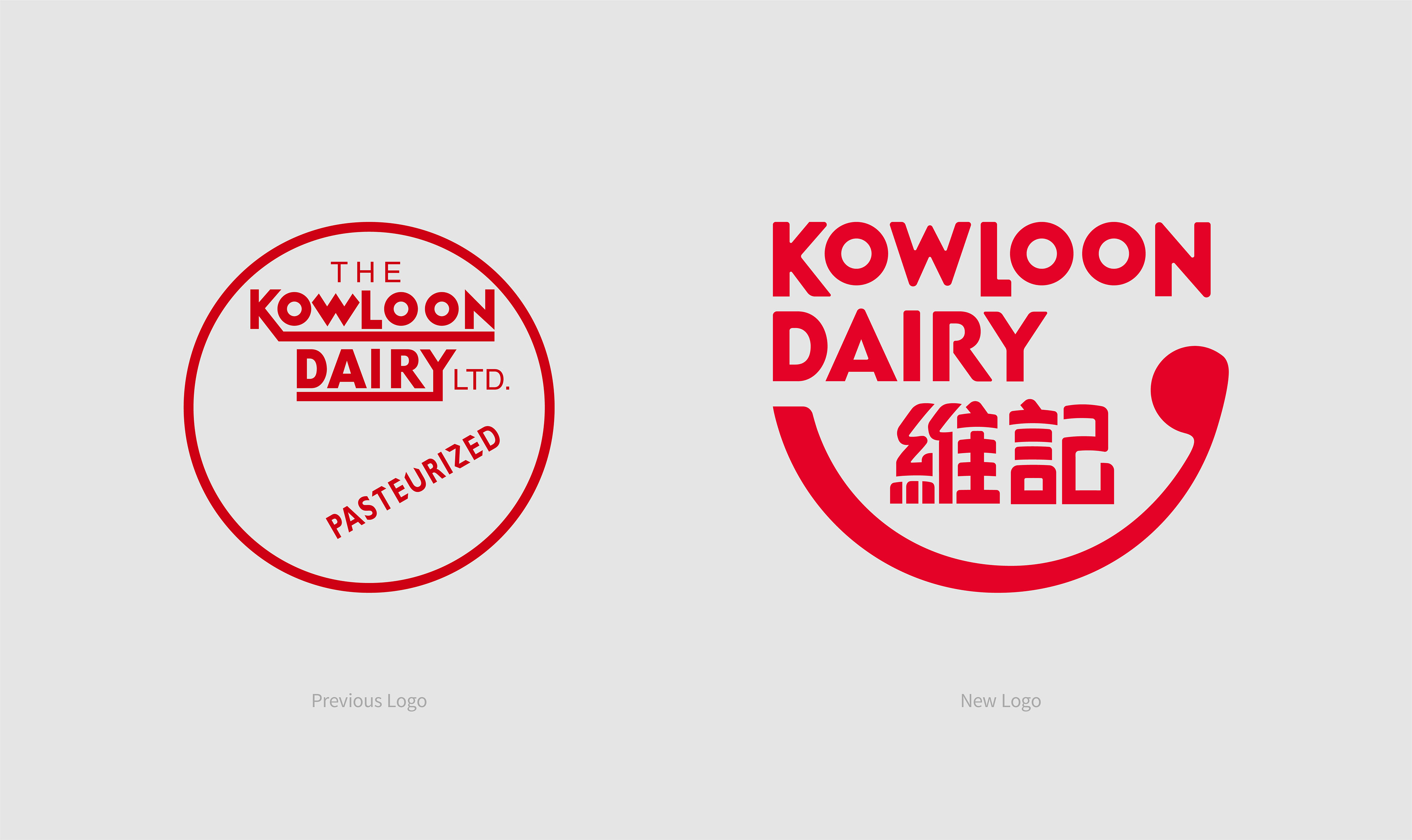
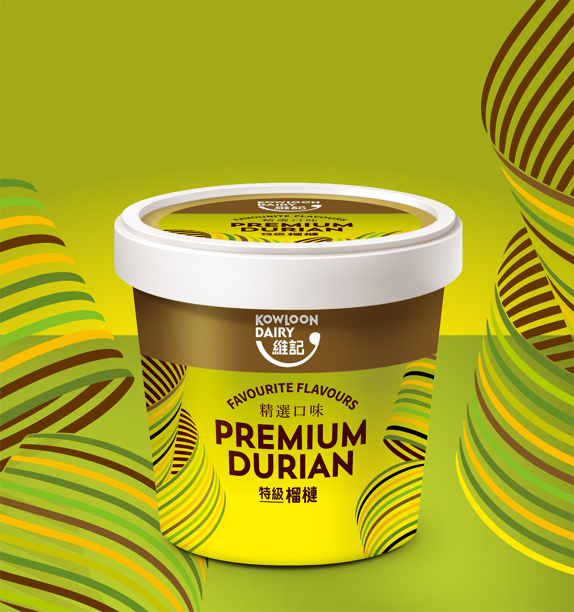
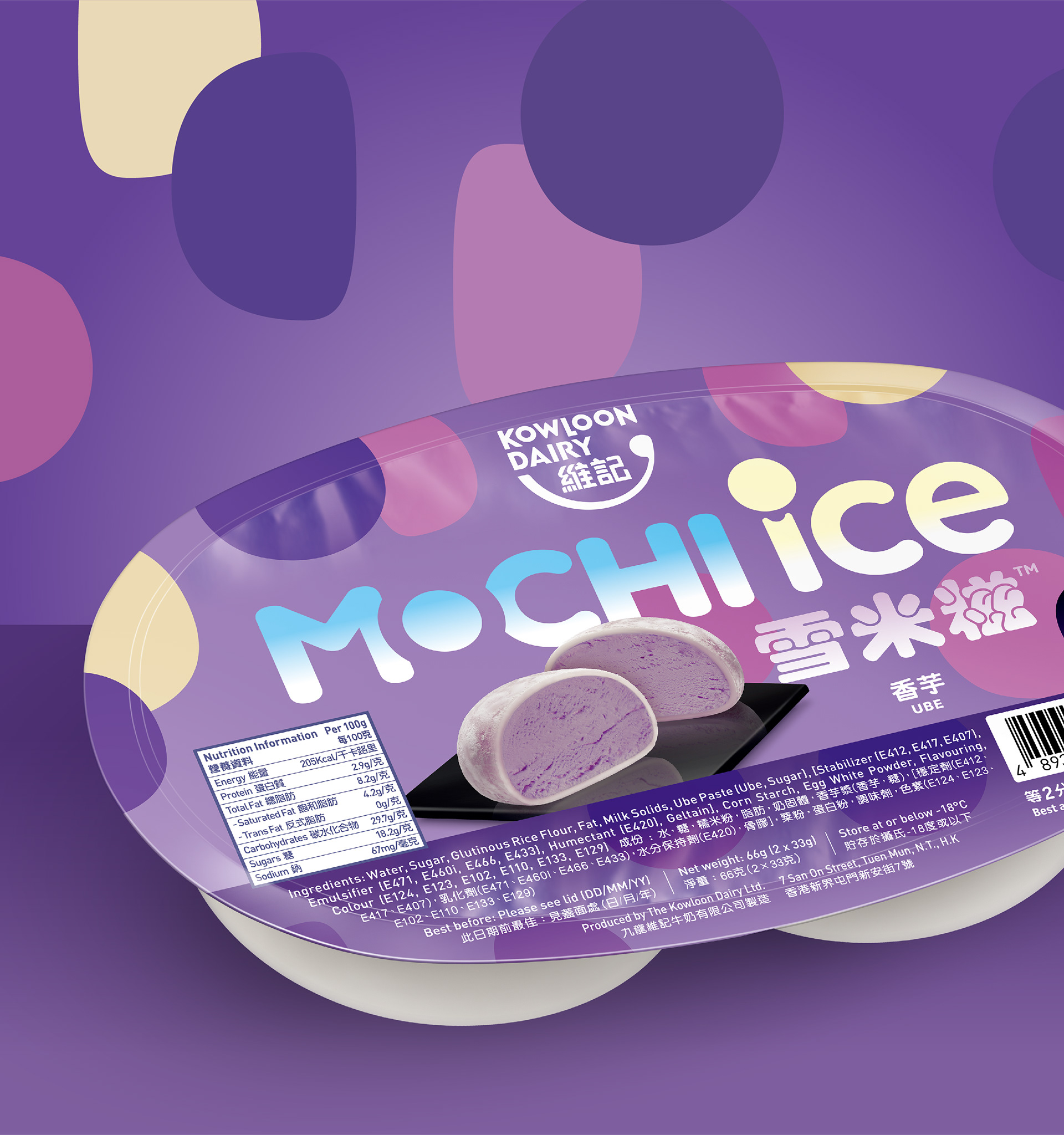
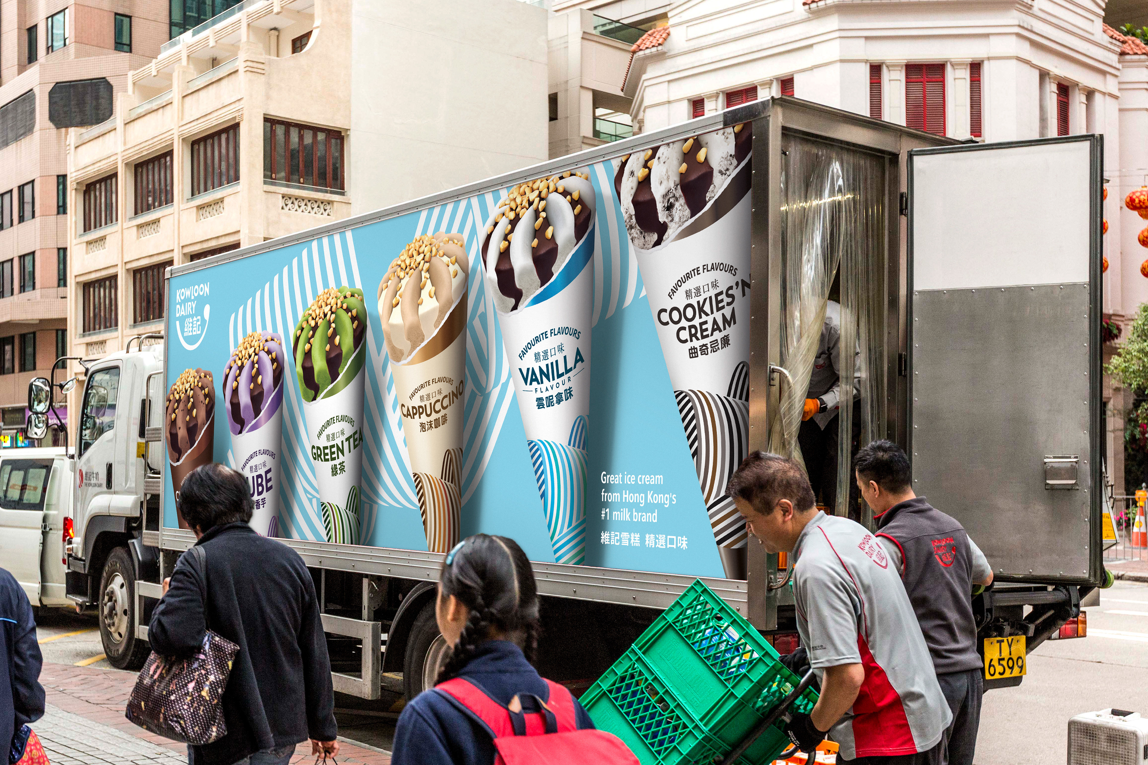
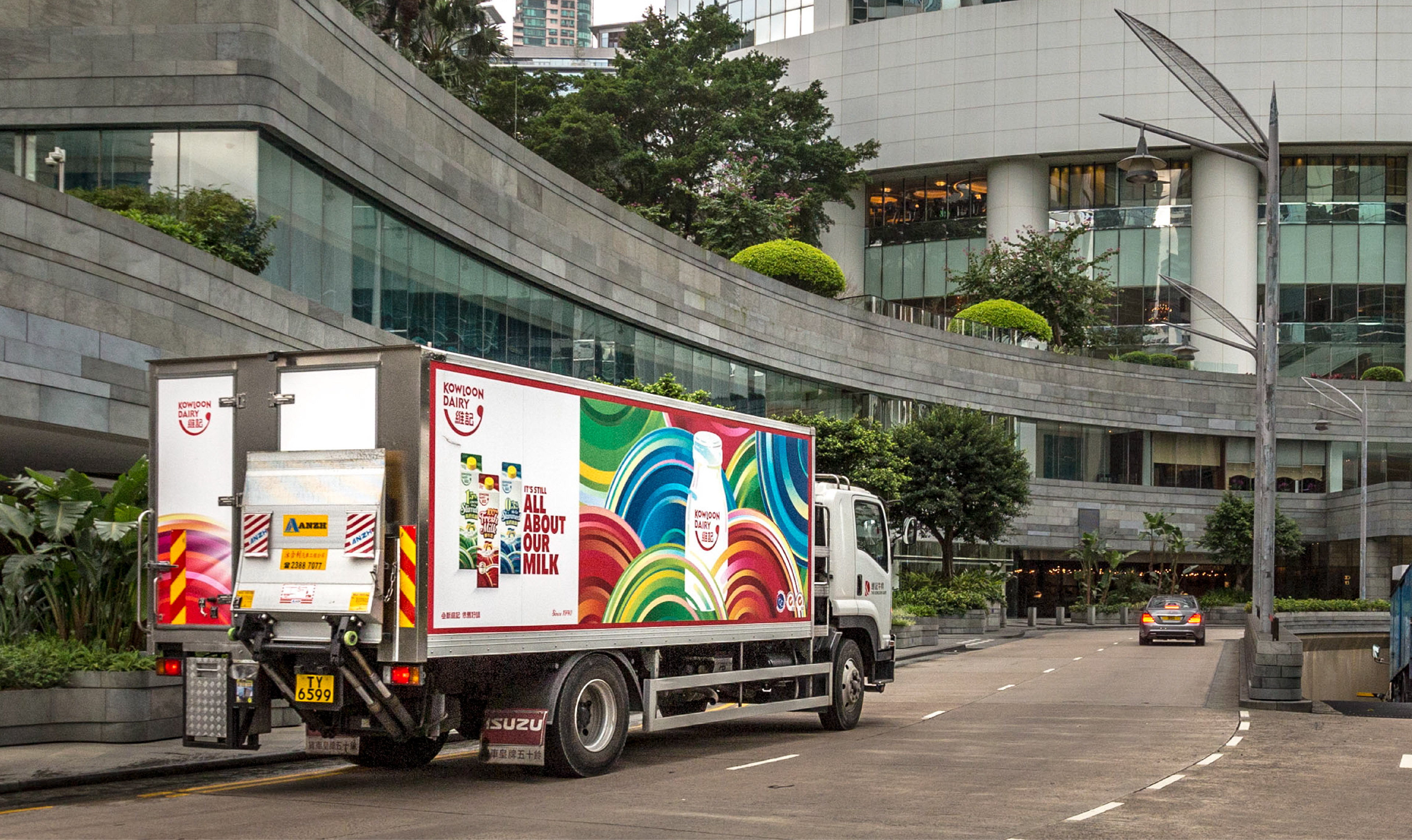
The essential component of the new brand identity system is the brand signature, widely applied on all of Kowloon Dairy’s new packaging and elsewhere in print and online, from social media to outdoor advertising to delivery trucks to souvenirs. Encompassing the brand name in both Chinese and English, it was derived from the original circular logo on Kowloon Dairy’s iconic glass milk bottle — still in use.
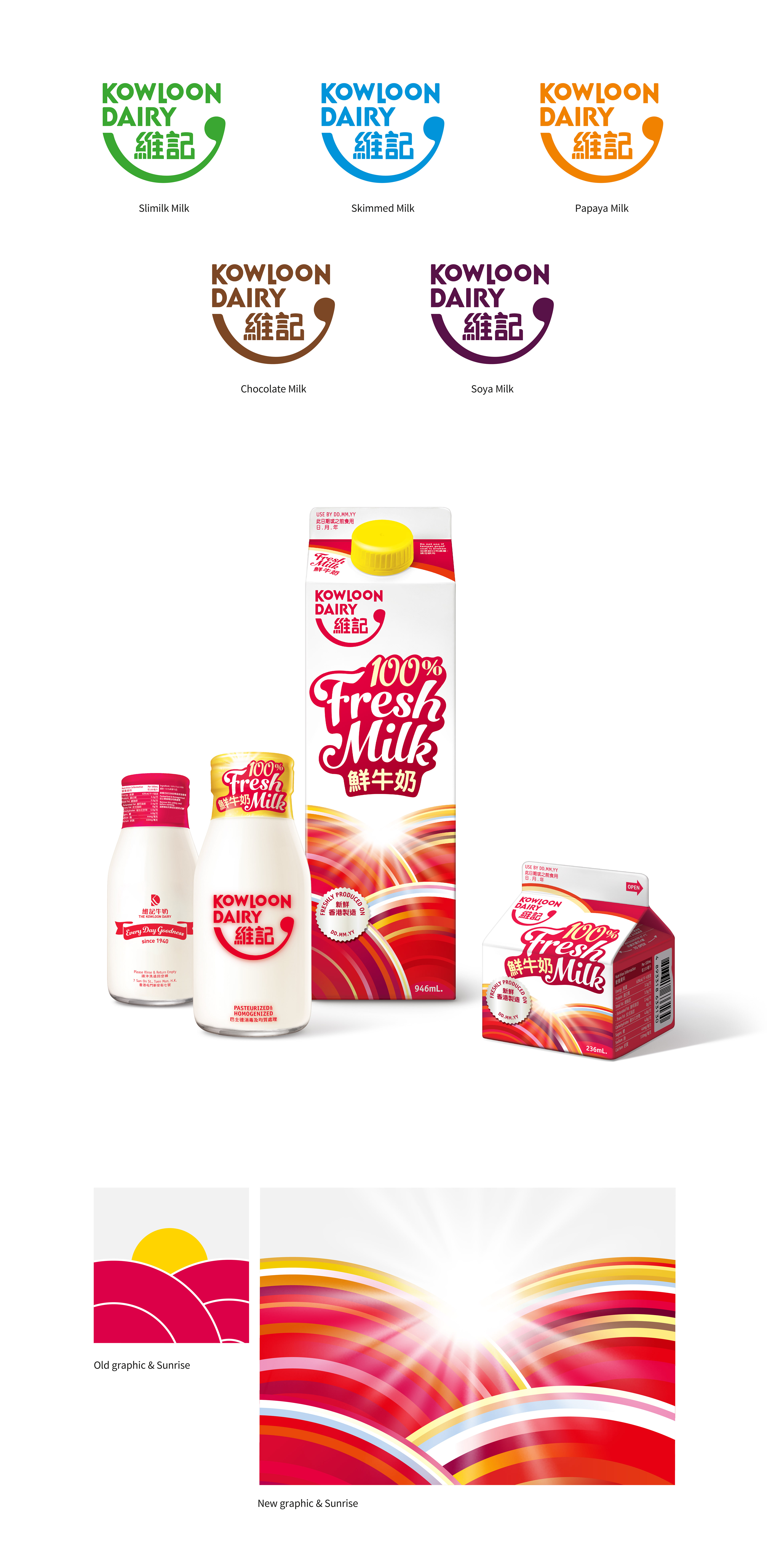
The logo is set in reversed white for Kowloon Dairy’s ice-cream line of products, including ice-cream cones, ice-cream cups and the renowned mochi-ice.