Hong Kong Jockey Club
The Club’s Membership division sought to update recognition of its brand and to strengthen the loyalty of its growing ranks. The creative brief called for merging the Club’s traditions and its Members’ contemporary lifestyle expectations, with a view to positioning the Clubhouses to be the best in Asia. One of the key elements of this program was the redesign of the complete range of packaging for the Club’s F&B products and accessories.
The Club’s Membership division sought to update recognition of its brand and to strengthen the loyalty of its growing ranks. The creative brief called for merging the Club’s traditions and its Members’ contemporary lifestyle expectations, with a view to positioning the Clubhouses to be the best in Asia. One of the key elements of this program was the redesign of the complete range of packaging for the Club’s F&B products and accessories.
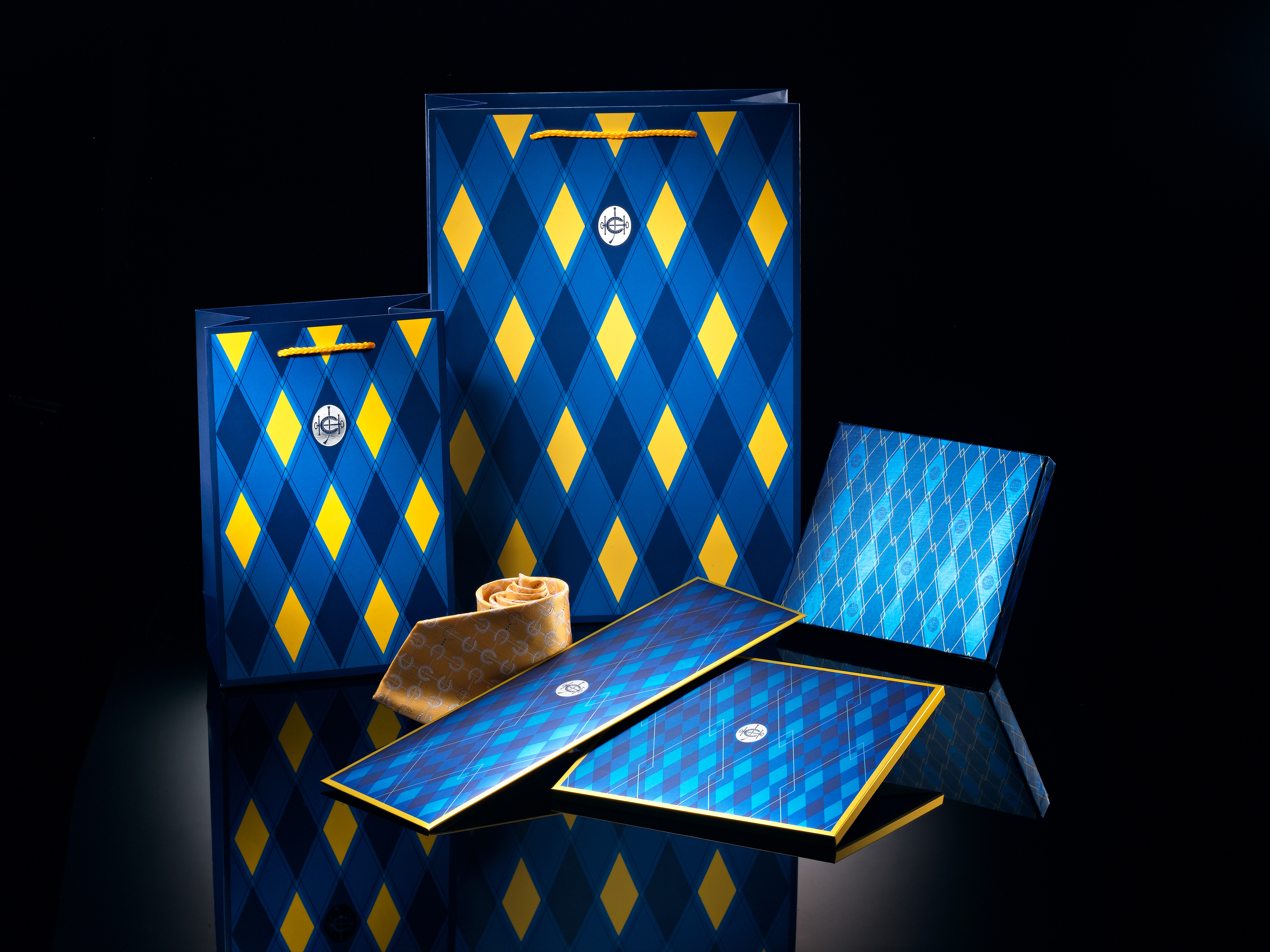
The packaging required a wholly original style to express the unique privilege of membership, reflect the Club’s racing heritage and retaining a ‘clubby’ feel. The diamond-shape visual concept has auspicious meanings in both Eastern and Western cultures. In the racing tradition, the argyle pattern is universally recognized.
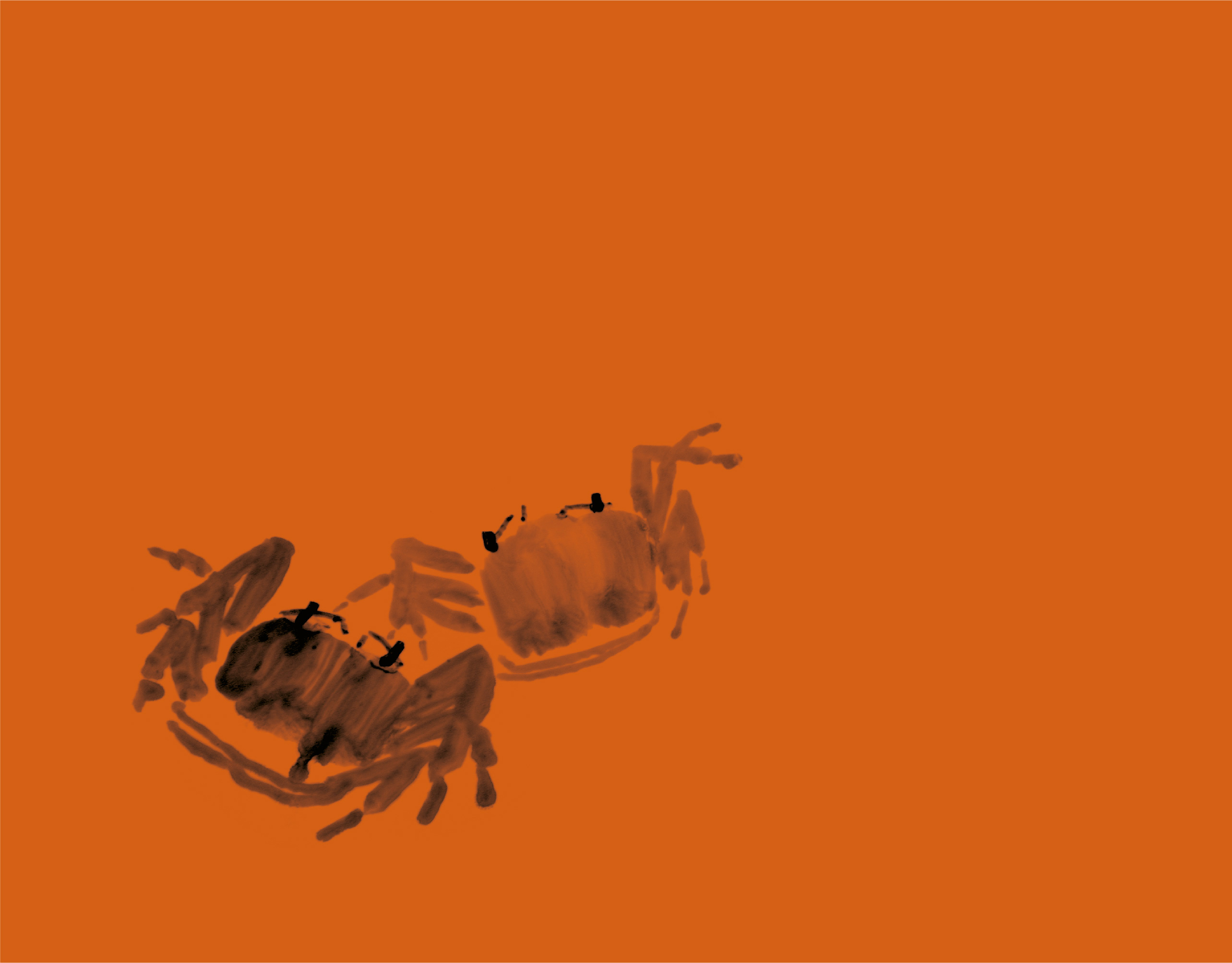
The specially commissioned Chinese ink paintings of horses and riders represent the recreational aspects of Club membership.
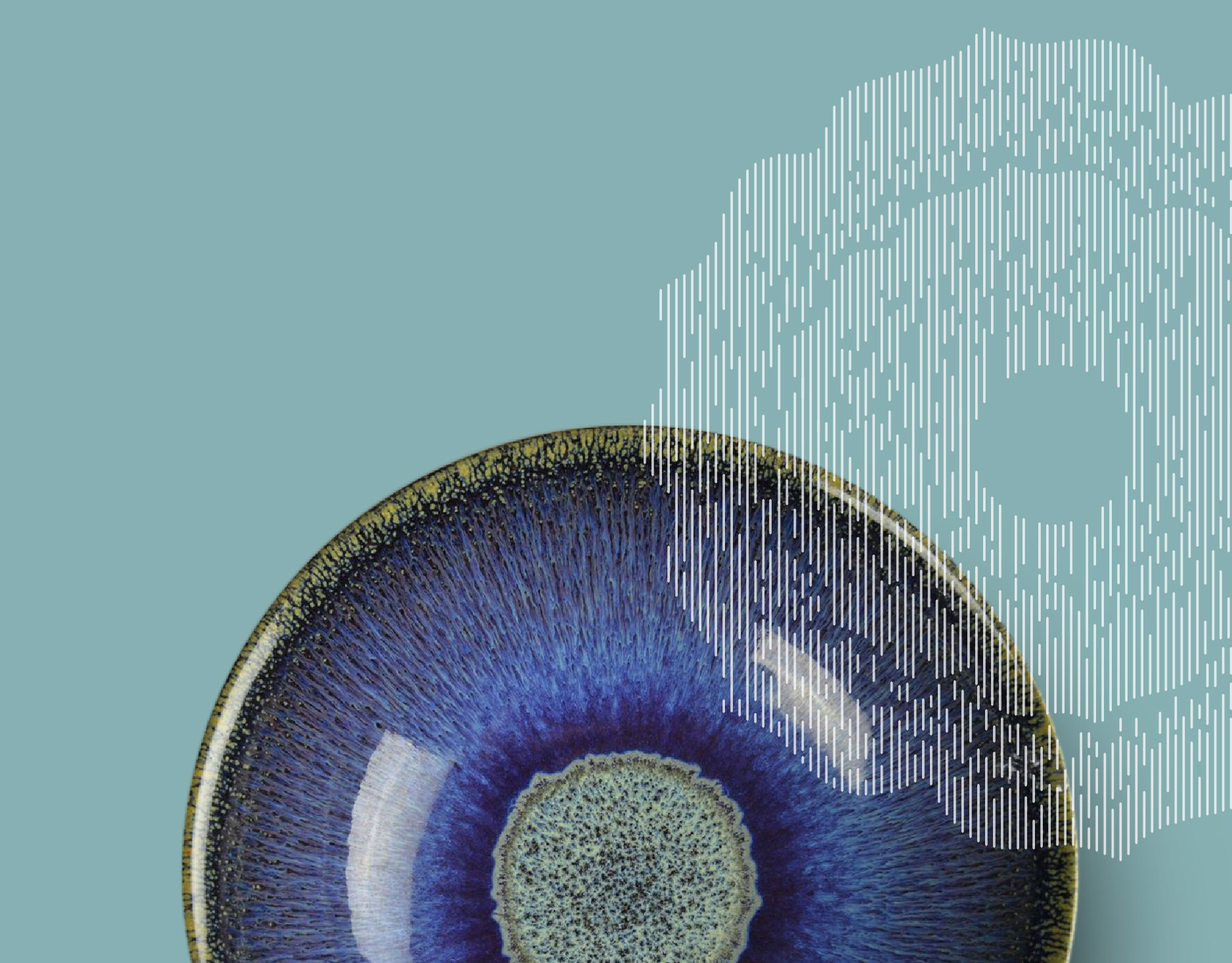
The original designs for the sauce and cake packaging suggest the clean lines and subtle curves of elegant Chinese furniture.