We were asked to rebrand this Michelin-starred family-owned restaurant and to design a range of packaging for its Fine Foods retail division.
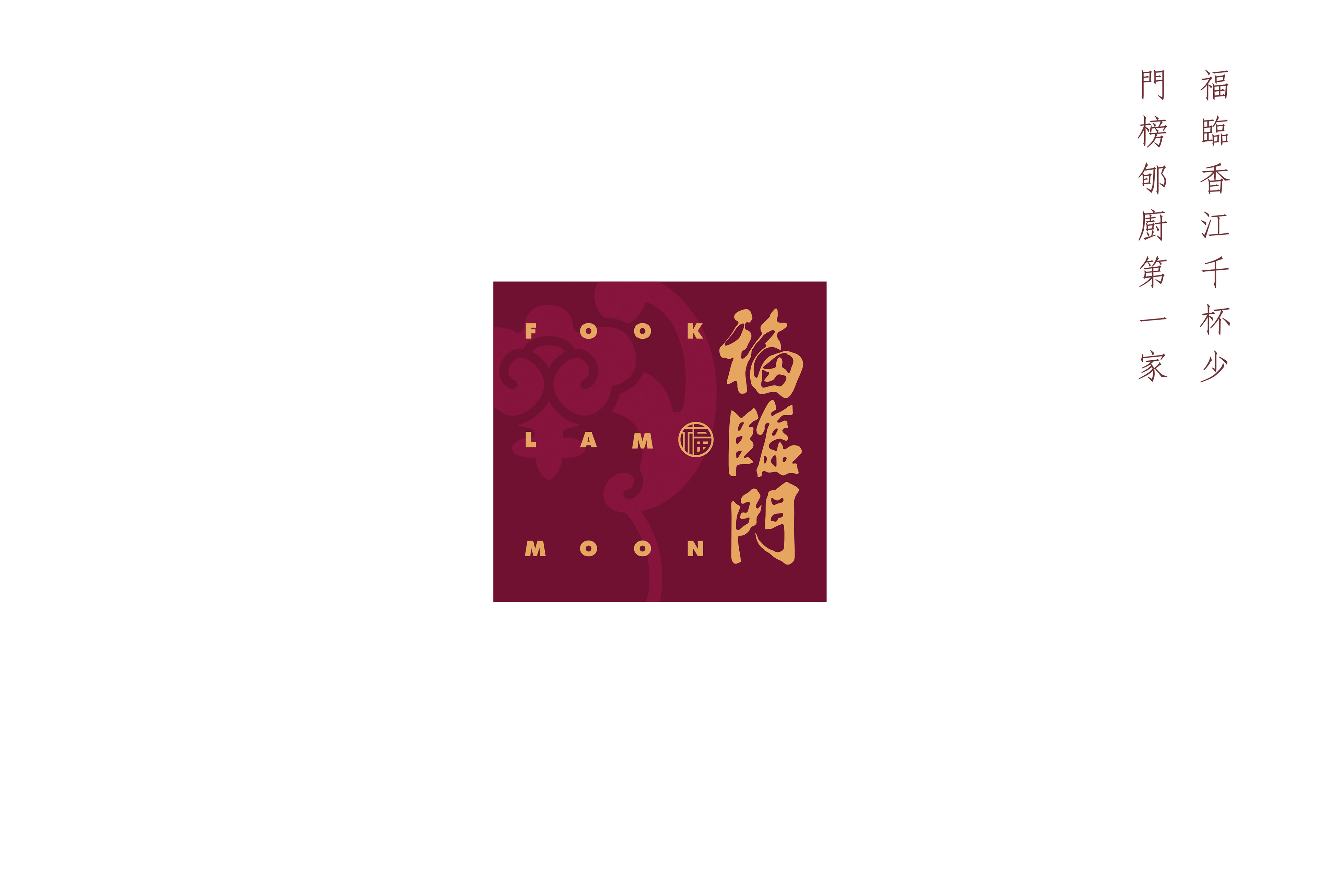
New icon for an iconic establishment
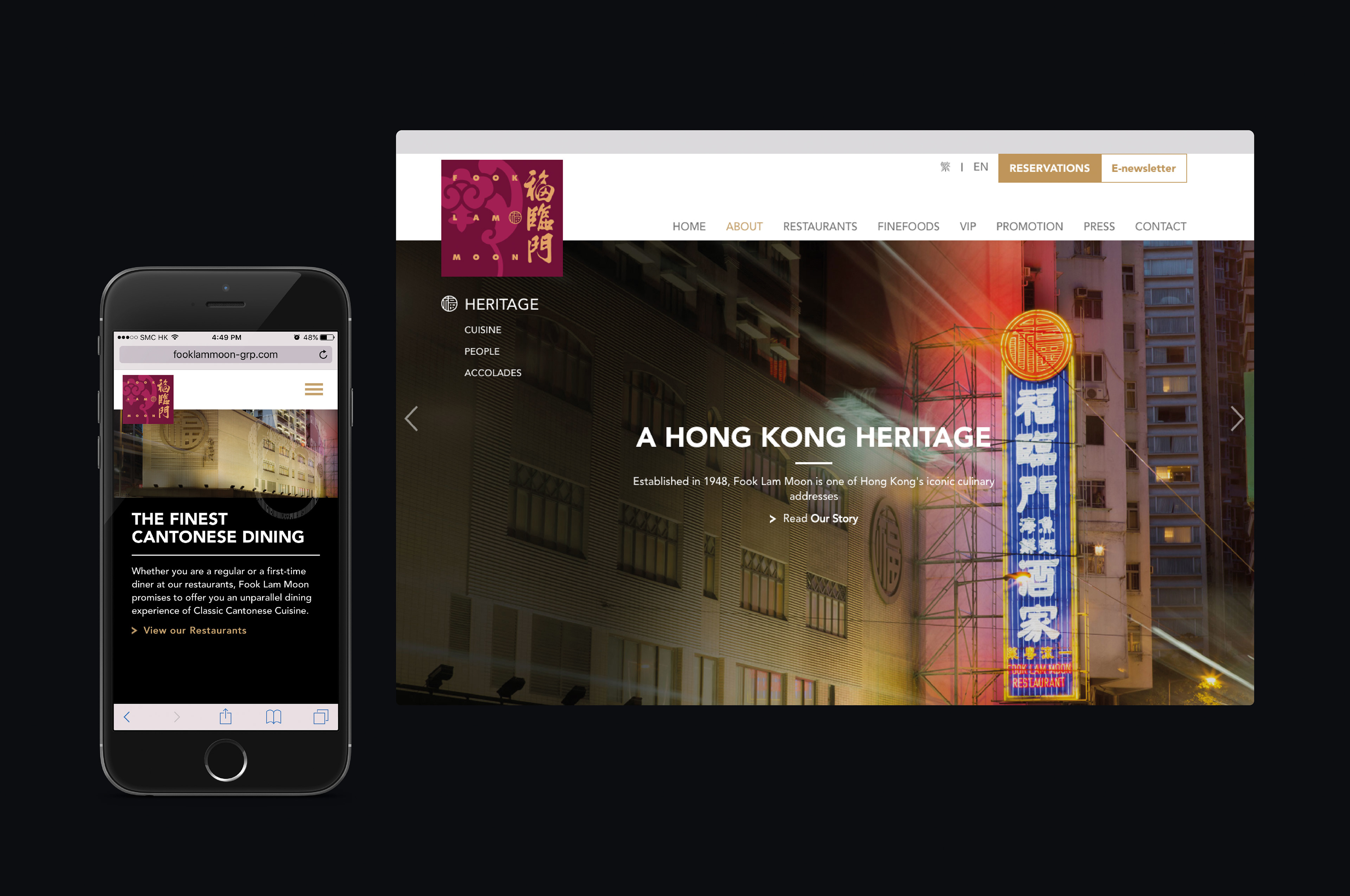
Founded in 1948, Fook Lam Moon is synonymous with refined Cantonese cuisine. Its name literally translates as “Arrival of Good Fortune At Your Door.”
The key criteria for the rebranding were:
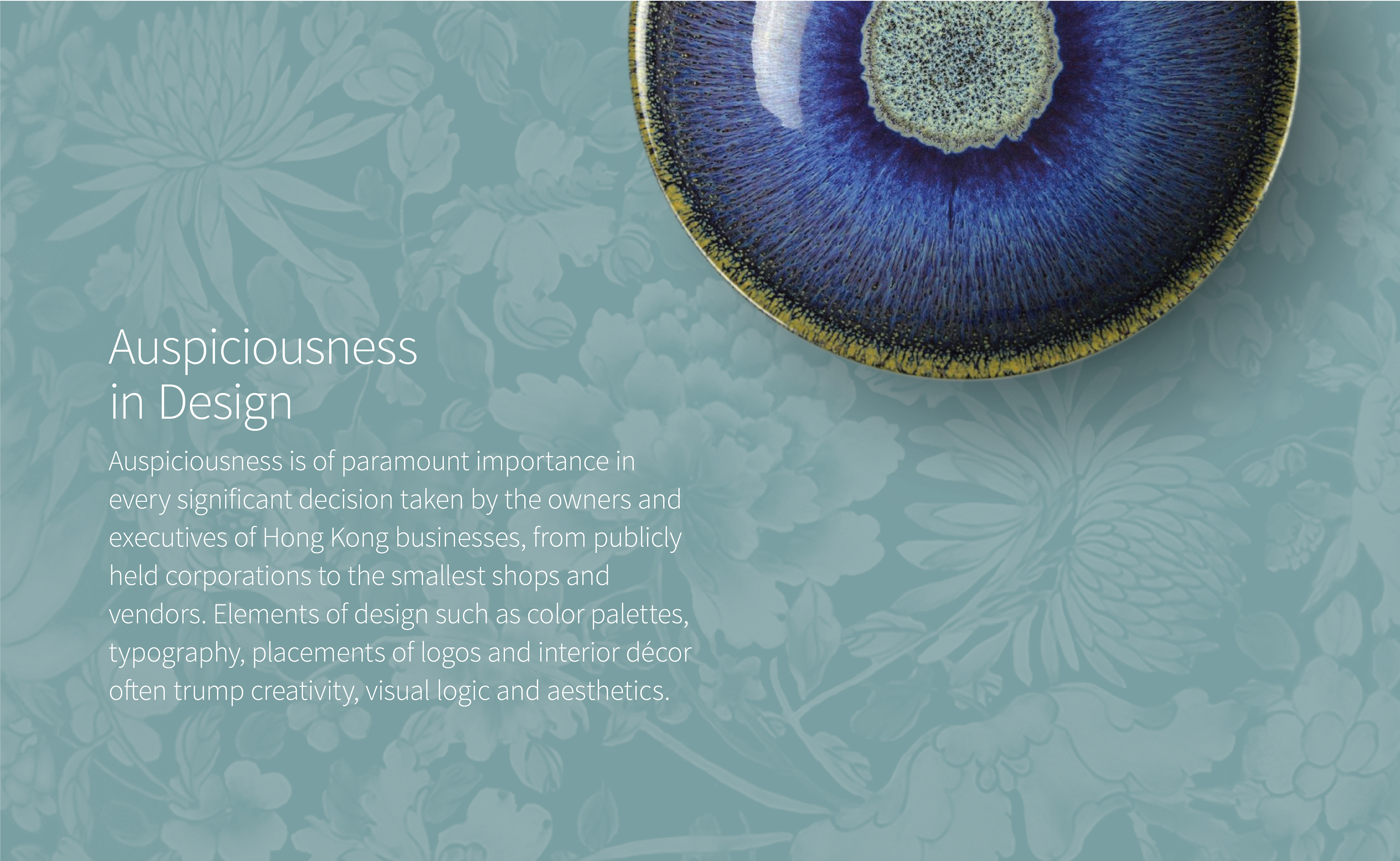
• Traditionally auspicious colors had to be applied to the identity.
• The Chinese lettering in the restaurant’s original logo could not be altered.
• The identity had to be bilingual.

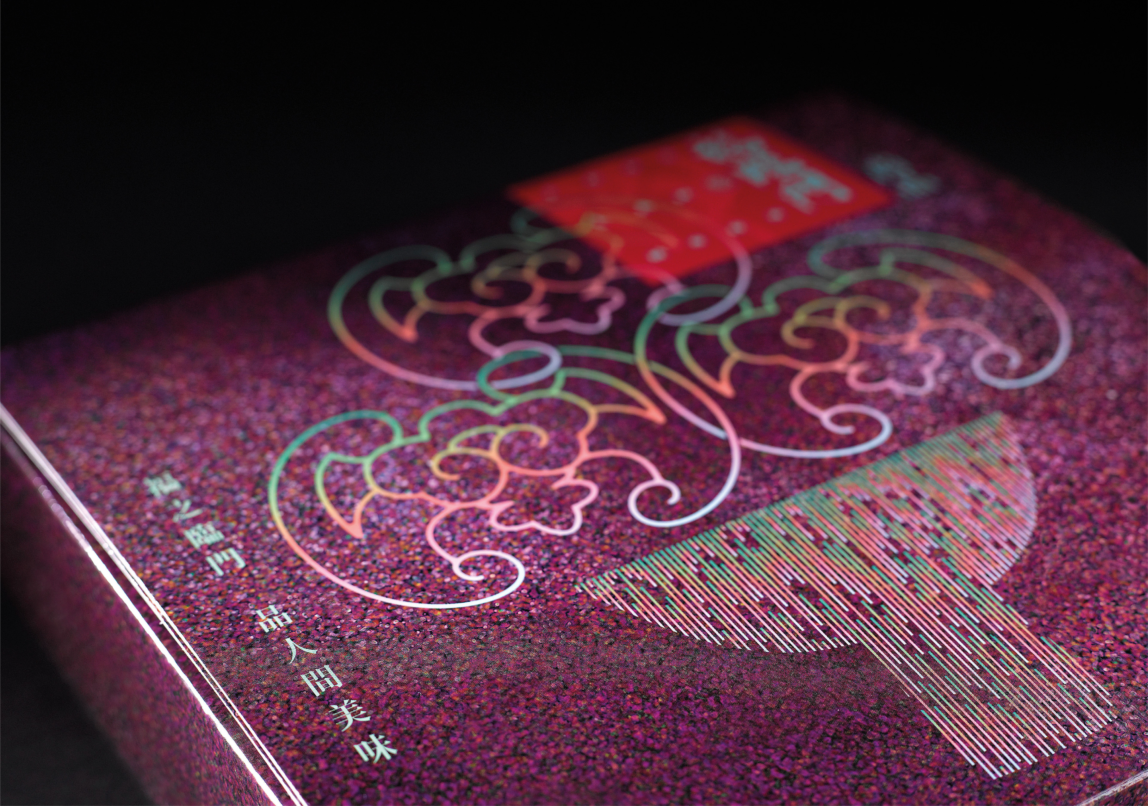
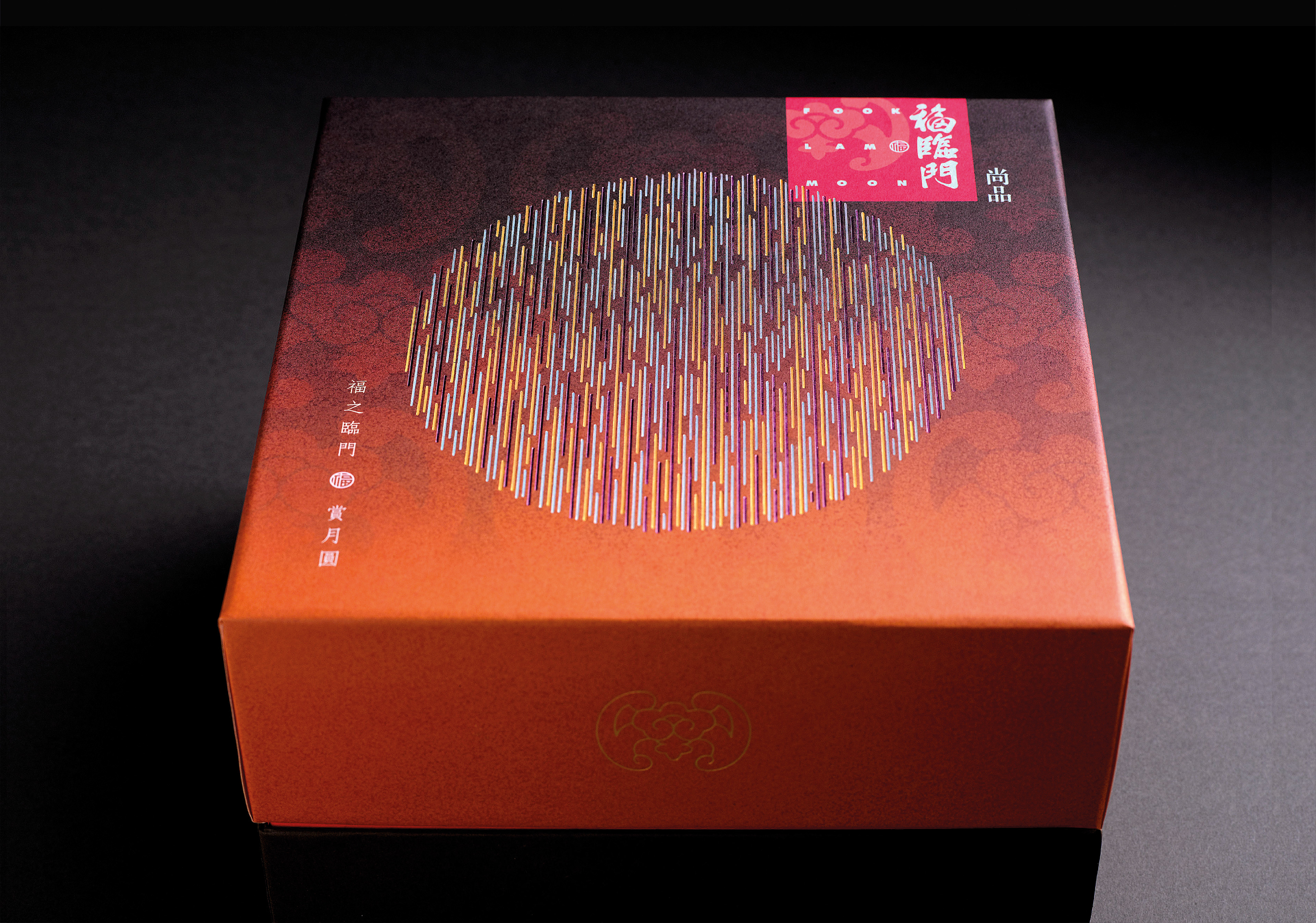
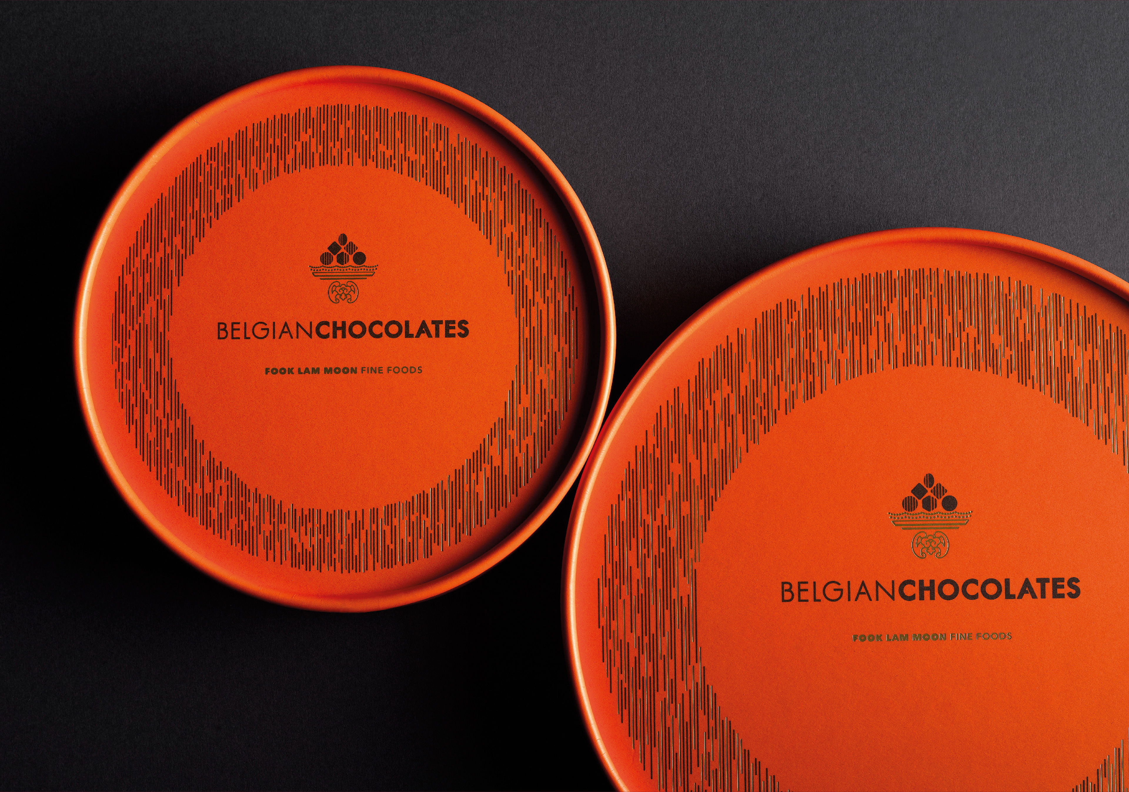
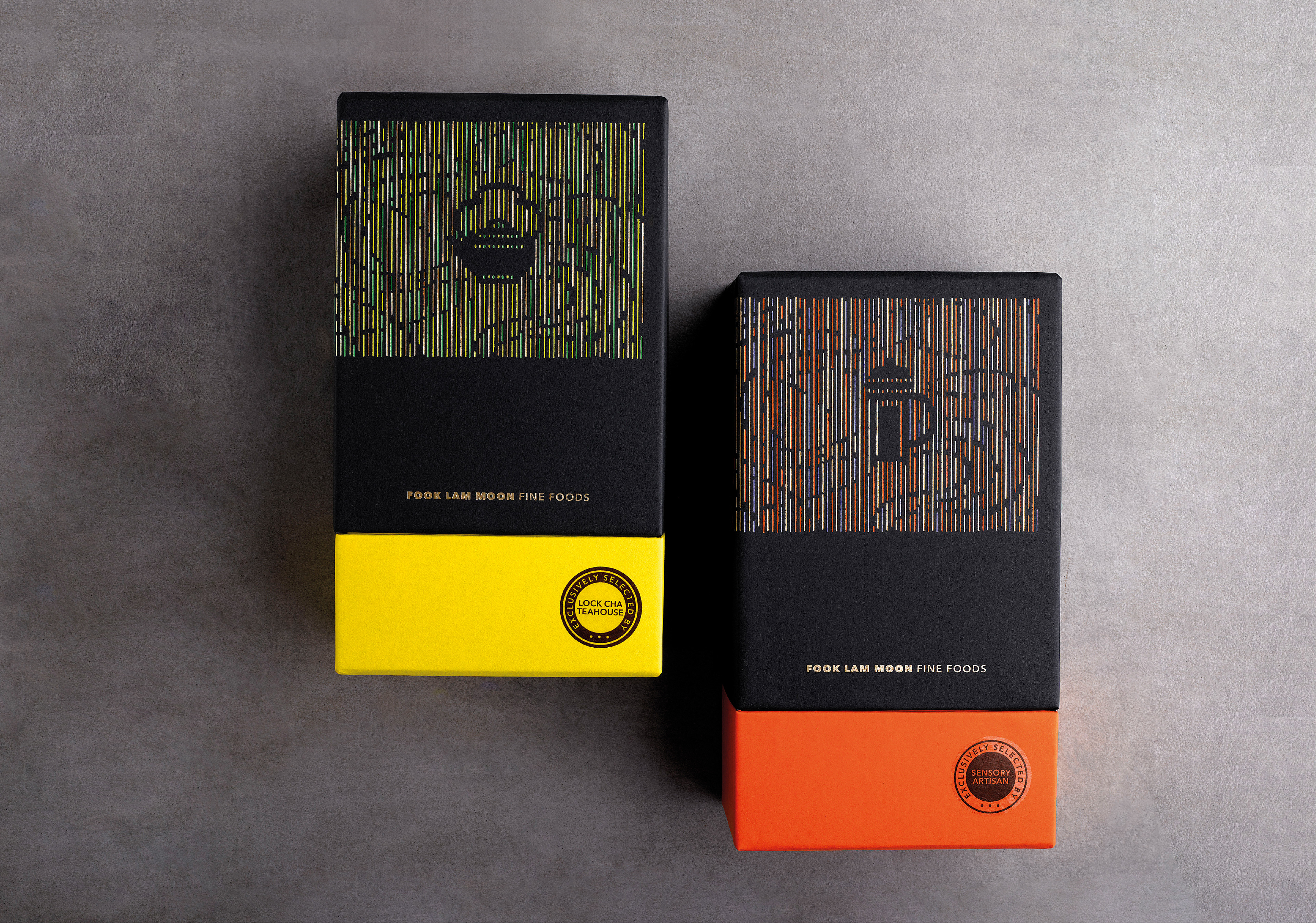
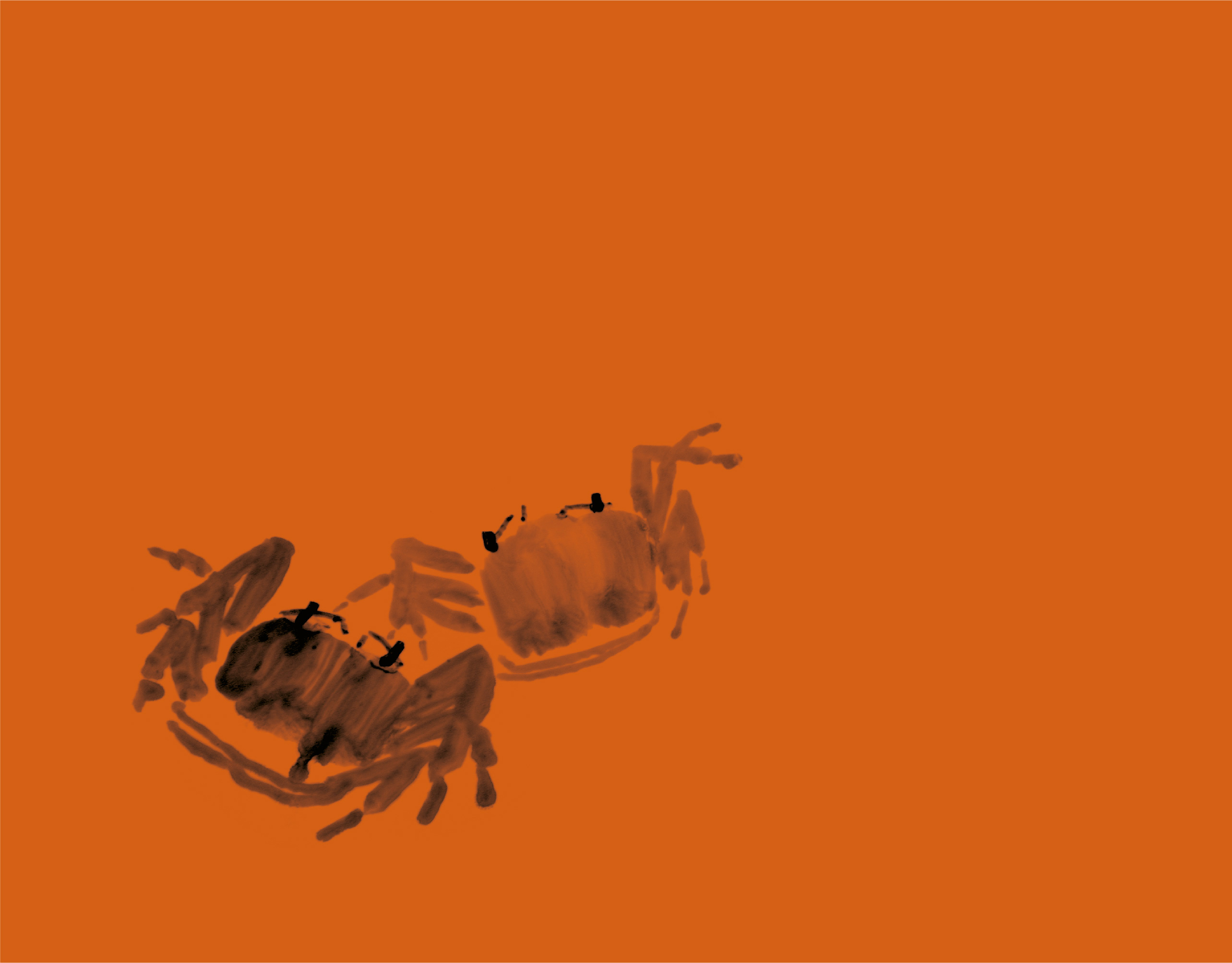
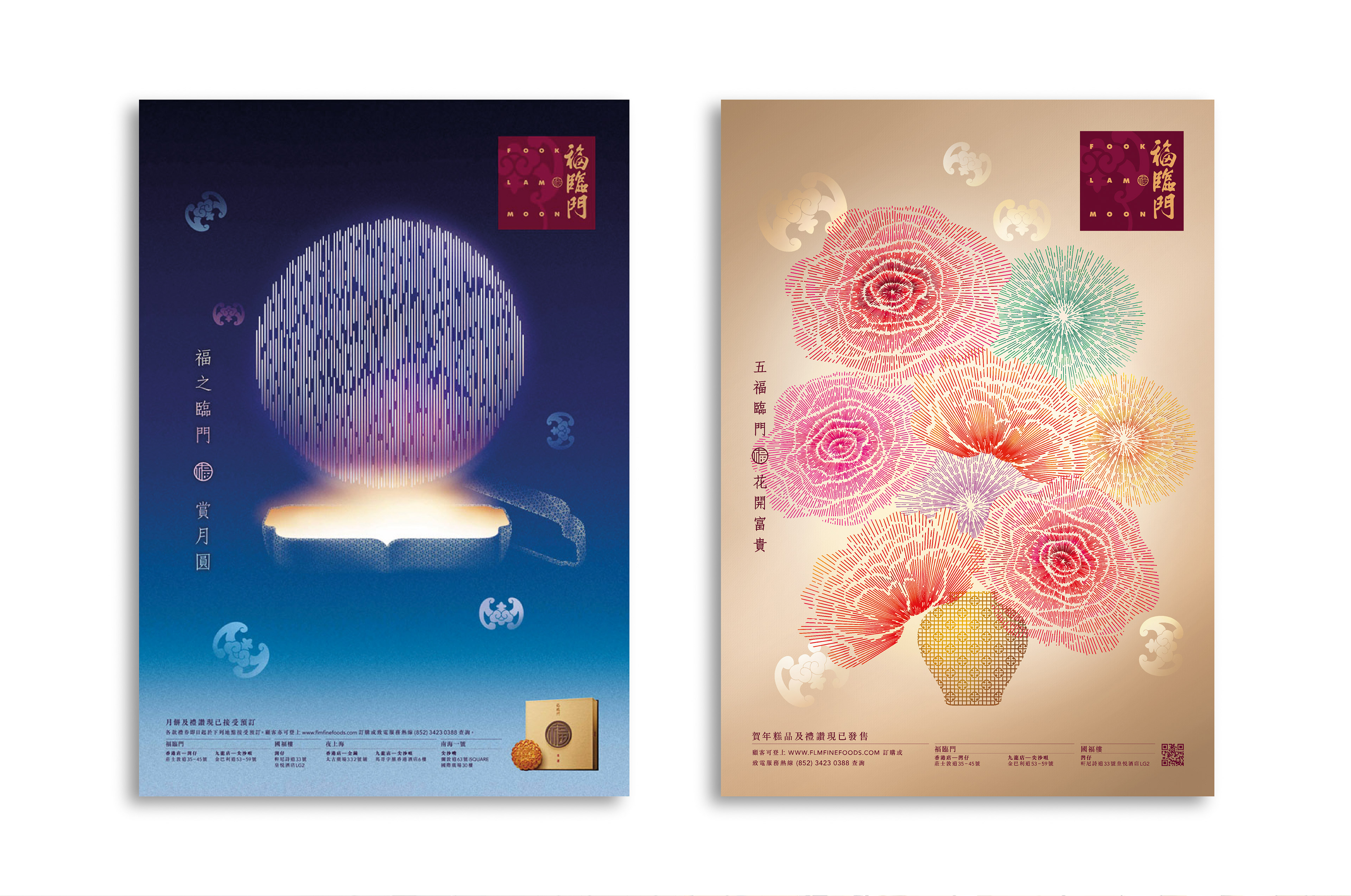
The selected concept was a type-driven design evoking a traditional Chinese door. A bold and elegant bat motif was incorporated, symbolizing good fortune. The Chinese for ‘bat’ shares the same phonetics as ‘Fook.” The sight of a bat flying close to one’s home is considered most auspicious.

Fook Lam Moon Fine Foods
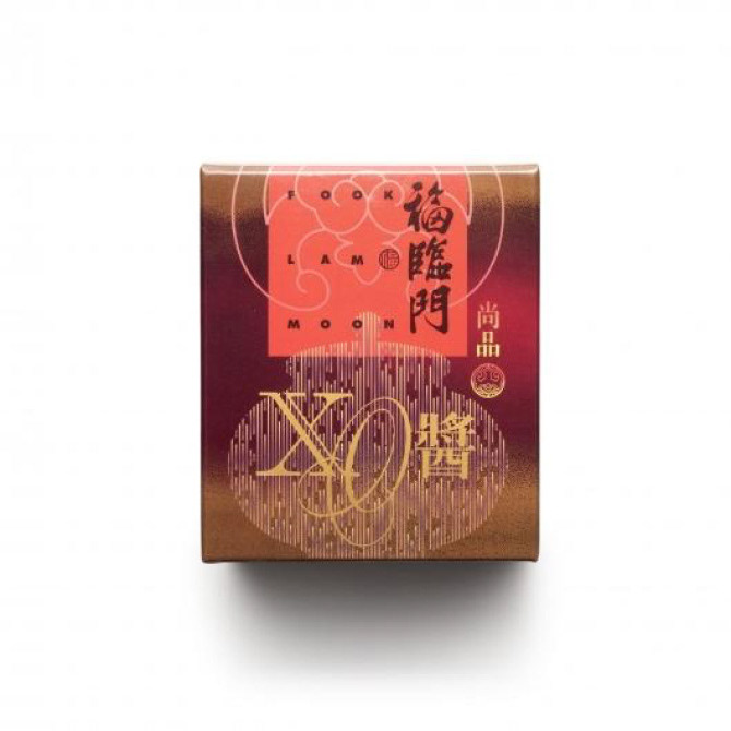
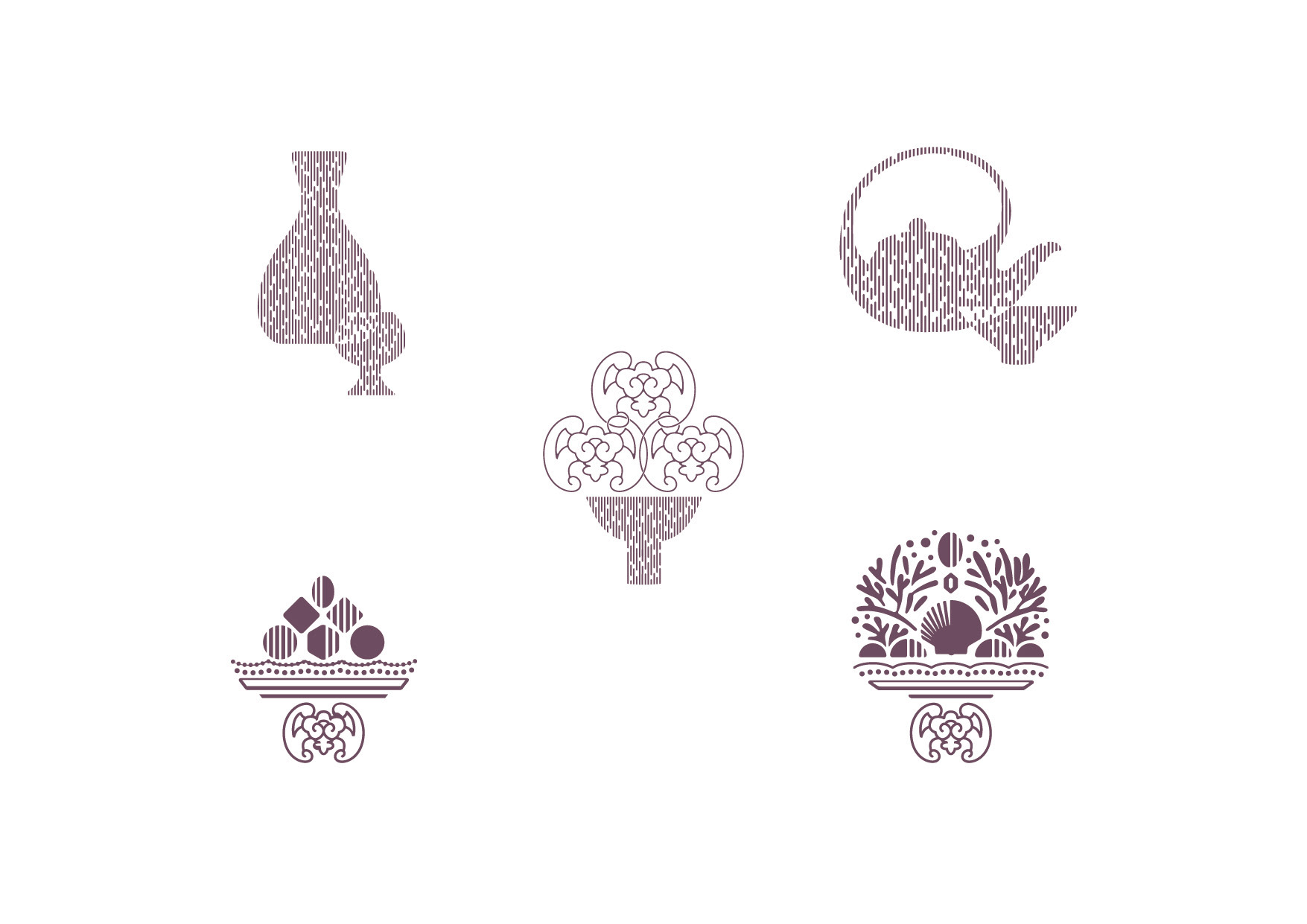
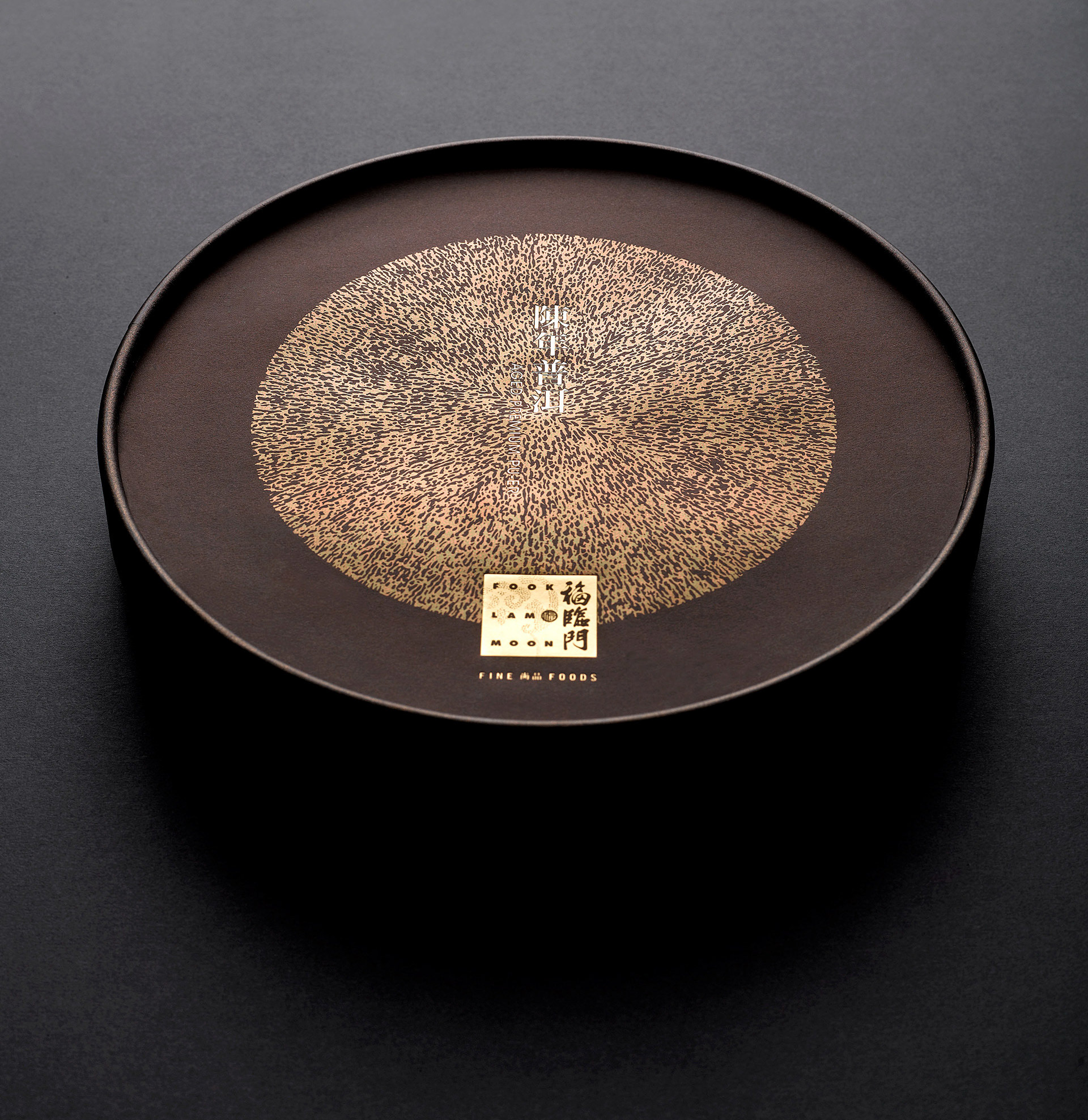
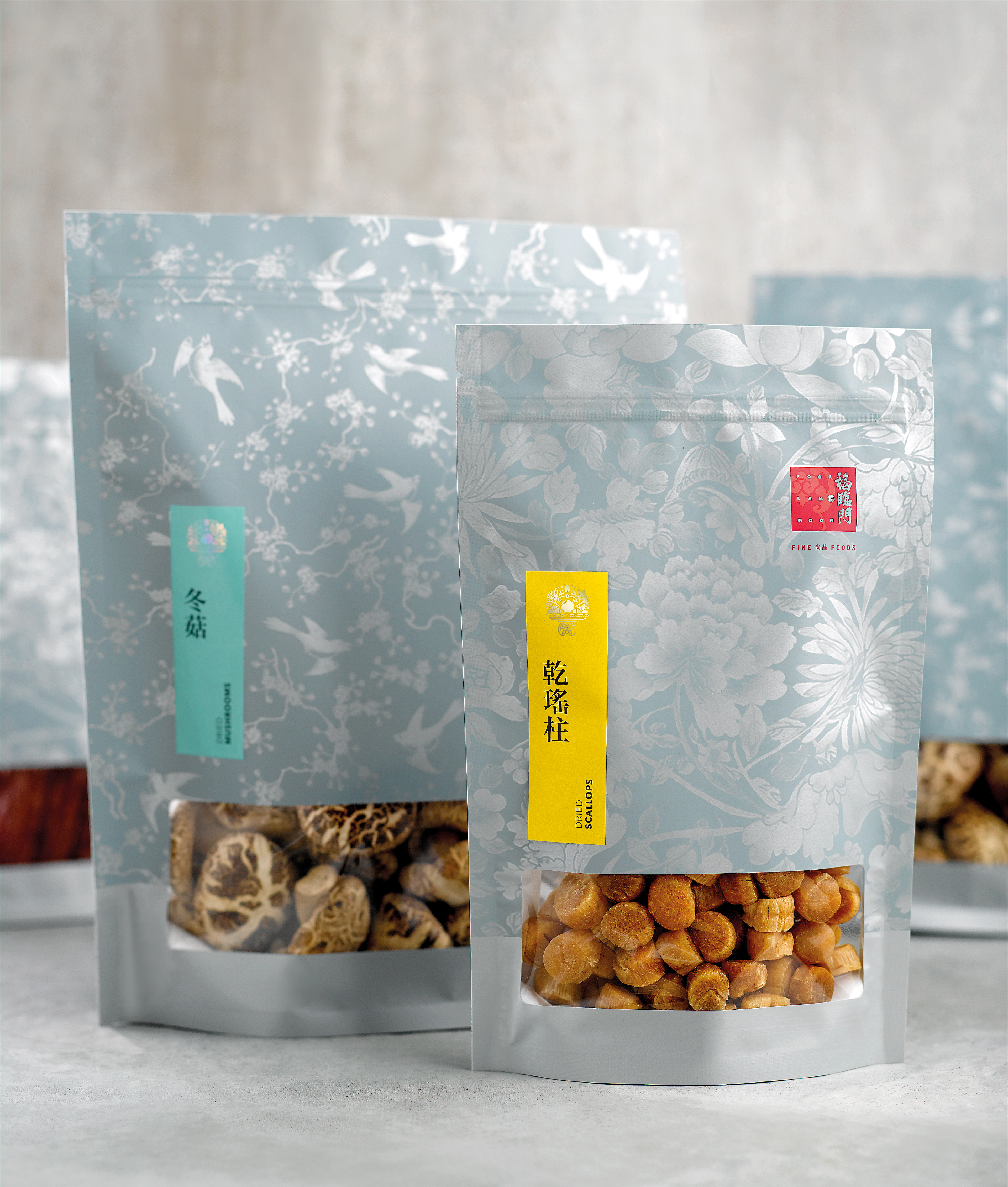
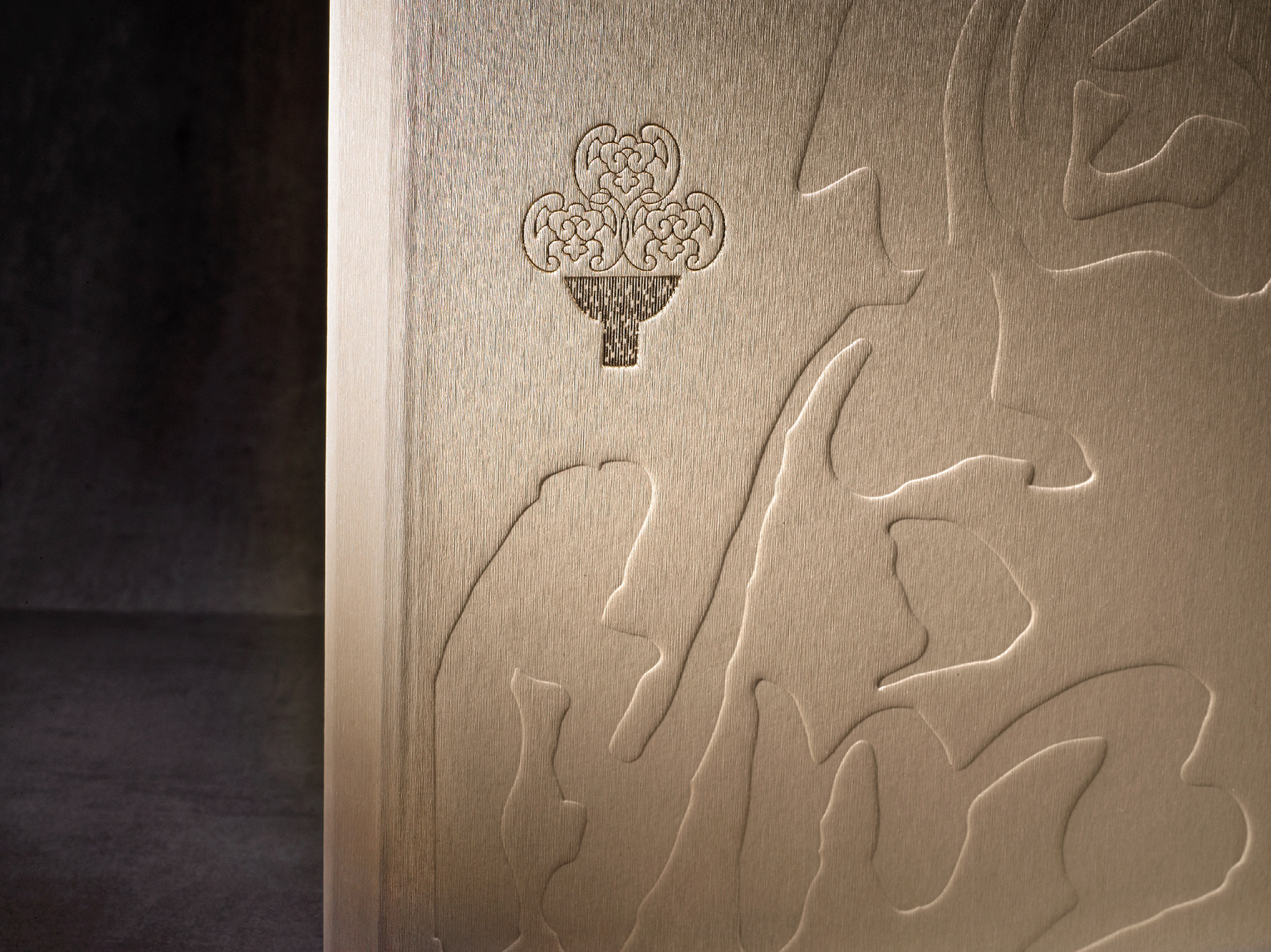
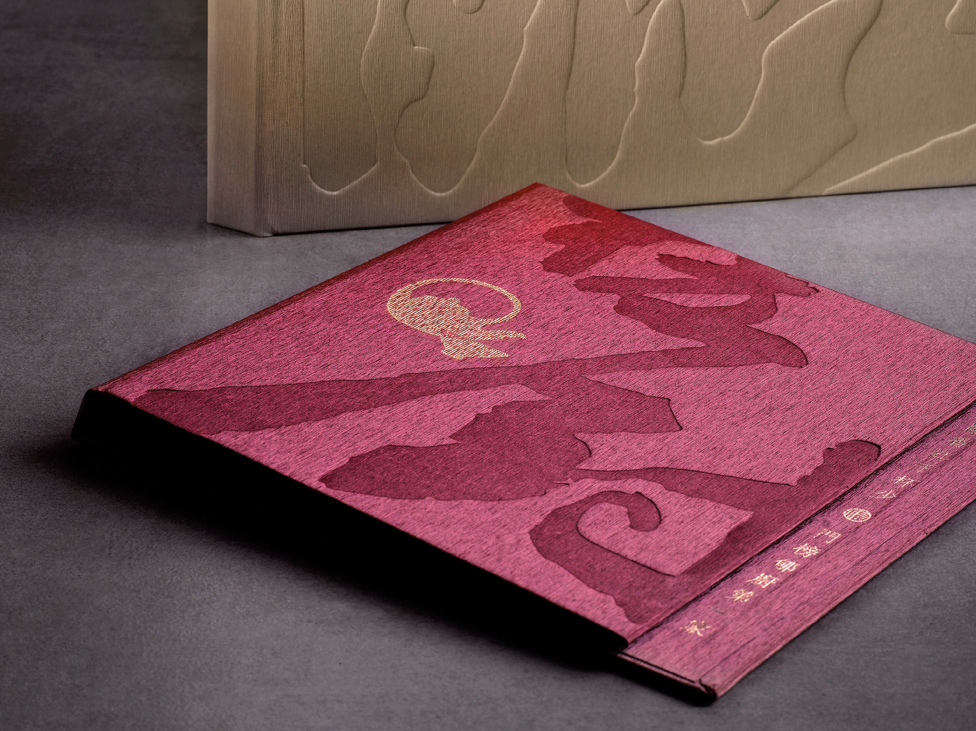
The simple forms of Chinese ceramics and porcelain inspired a range of graphics that were applicable across the full line of Fook Lam Moon’s fine foods. Vertical lines were used to create modern versions of traditional bats and other motifs. Packaging was created for everything from coffee, tea and chocolate to Chinese dried ingredients and festive foods.
The simple forms of Chinese ceramics and porcelain inspired a range of graphics that were applicable across the full line of Fook Lam Moon’s fine foods. Vertical lines were used to create modern versions of traditional bats and other motifs. Packaging was created for everything from coffee, tea and chocolate to Chinese dried ingredients and festive foods.